Blueprint Design System
Illustration, Design System, Branding
Summary
Designers from Fannie Mae’s Customer Experience Design (CXD) team collaborated in an ongoing effort to determine a cohesive visual direction as well as develop an illustration and icon library for Fannie Mae’s design system, Blueprint.
Client
My role
Ongoing contributor (discovery work, illustration creation, usage guidelines)
Team
Between two to six product designers, two content strategists
Timeline
2020 (ongoing)
Goal
Communicating complex topics with visuals
To help effectively and consistently communicate complex mortgage-related topics and concepts to customers, the design team needed a systematic and scalable solution that designers could implement across all digital products and expand as new needs arose.
Previous Blueprint style—The previous Blueprint illustration style featured large, detailed illustrations that did not scale well across different applications.
Process
Conducting baseline user and brand research
✏️ Reviewing existing brand guidelines
Our first step was to review Fannie Mae’s overall brand guidelines used primarily for marketing and public-facing materials. We highlighted areas of inconsistency, identified gaps, and used this as a starting point for our explorations.
📍 Reviewing the current visual landscape
We also took stock of the existing visual landscape across Fannie Mae’s digital products. We also reviewed prototypes created by CXD designers to understand how they were currently incorporating illustrations into their work.
🧭 Aligning visuals to voice and tone guidelines
Our team’s content strategists reviewed Fannie Mae’s voice and tone guidelines. We then used this to steer the visual direction and ensure the two were aligned and complemented each other.
🏠 Identifying illustration topics
The team asked designers to identify what subjects or topics they regularly designed for. We also conducted audits, ran surveys, and gathered feedback from group sessions and discussions.
Designer feedback—We used MURAL to collect feedback from designers on our overall approach. We asked designers questions about the current collection of icons, the illustration challenges they faced, and their comfort with the current guidelines.
Vision
Outlining a visual direction
The following statement helped set the direction for our illustration style:
The Blueprint visual style is all about bold minimalism; it’s simple without being airy.Visual explorations
Basing our approach on foundational principles
✨ Visual direction goals
Solve designers’ illustration needs
Provide a systematic solution that any team could use for any problem
Use and reuse in a consistent way
Enable teams to contribute to and work together to test solutions
Adapt to any future changes in technology
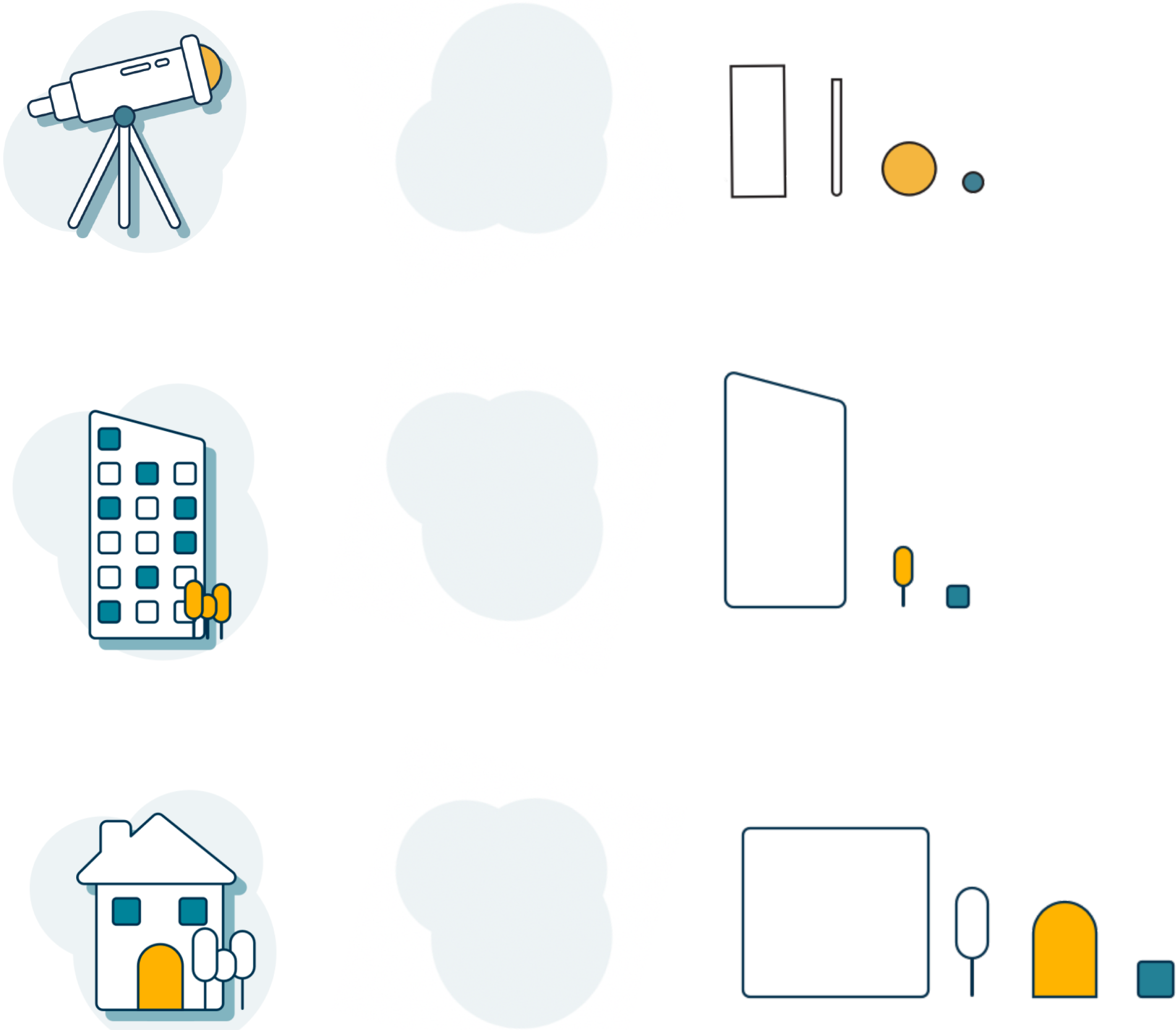
G-cons—We started with a set of basic component shapes that could be recombined to create our larger icons.
Component system
Building off of common elements
Throughout the discovery and exploration process, we established and built off of a set of smaller elements.
✅ Outcomes
Give designers the freedom to create new illustrations with clear guidelines
Design components that could be recombined and scaled up to larger illustrations
Create reusable symbols that would allow easy adjustments to existing designs
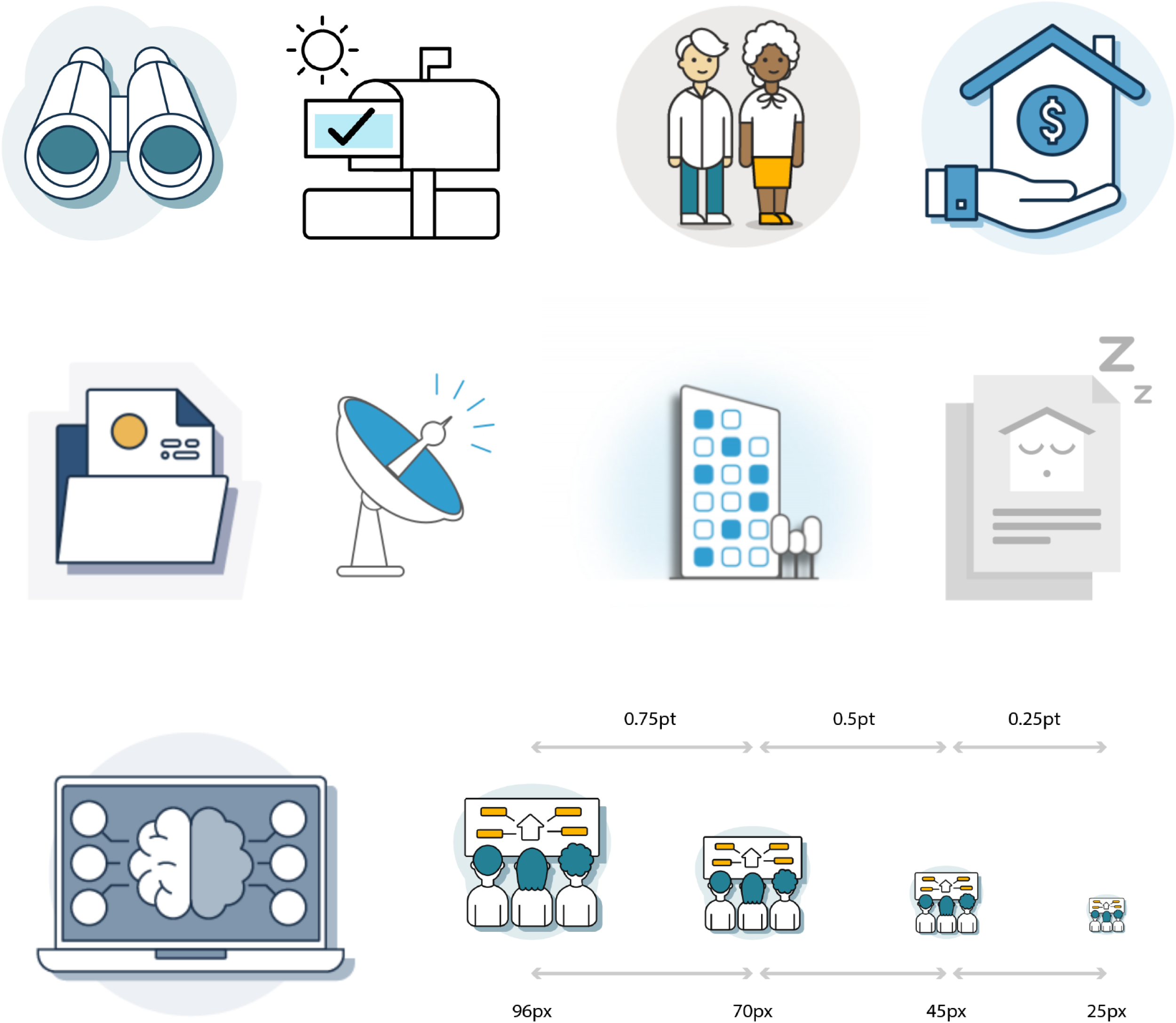
Explorations—The design team explored several visual directions during our discovery phase.
Design features
Exploring different visual styles
As we continued to iterate on the visual direction, we looked into variations on specific design features to determine which aligned best with our guiding statement.
🎨 Visual explorations
Outlines/strokes
Fills
Background shapes
Depth
Perspective
Corner radius
Color
Outcome
Building out a preliminary illustration system
We developed a starter set of illustrations and icons and began packaging those into a reusable and flexible component library.
📚 Developing a graphic library
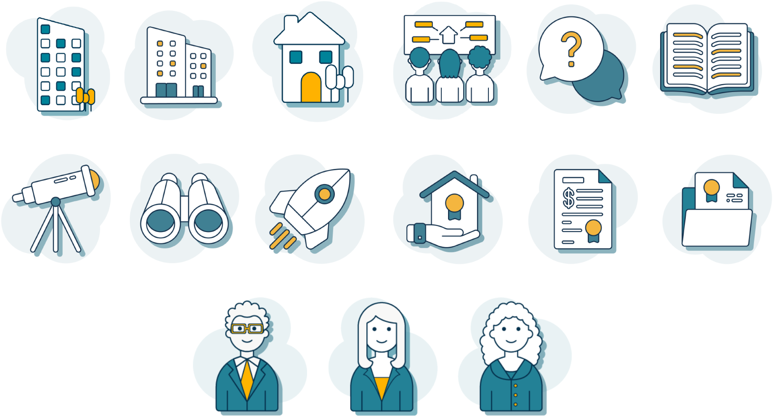
We created an initial set of 30 graphic icons (g-cons) based on the subject areas we identified, following the visual direction the team landed on. These were meant to convey abstract ideas and make concepts easier to grasp.
G-con library—We included around 30 finalized g-cons in our starter library.
🖼️ Expanding the graphic library
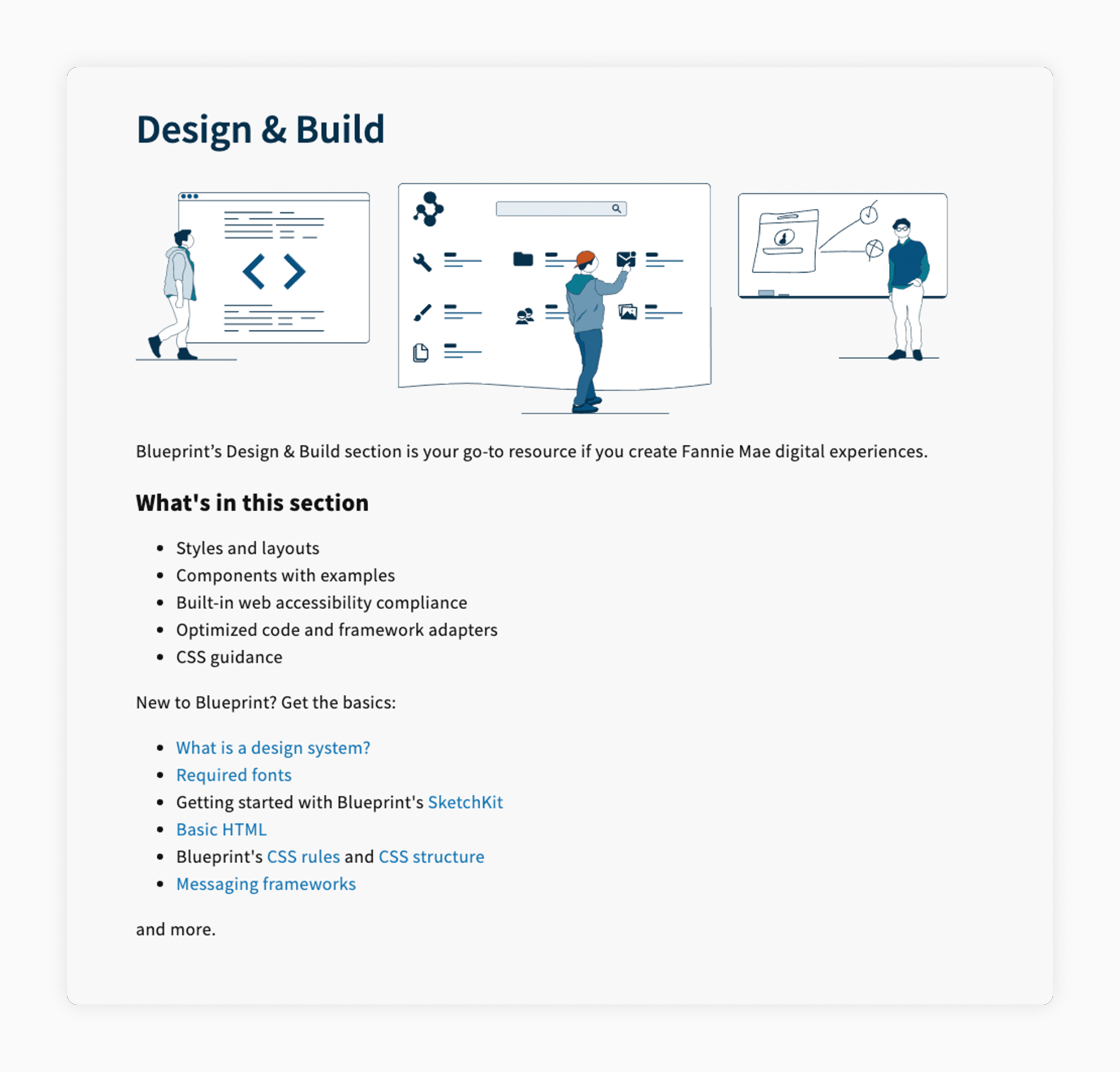
We created several larger scene illustrations that followed the same principles and guidelines as the g-cons. Since more space was available, we began incorporating additional detail and complexity into the design. We created the following scene illustration style to help convey information on the internally facing Blueprint website for designers and developers.
Scene illustrations—We created larger illustration areas that incorporated multiple g-cons.
✏️ Creating library documentation
To ensure consistency across creation and usage, we helped draft illustration guidelines for designers to reference. We created a preliminary Sketch library that included existing g-cons. Eventually, these would be incorporated into the overall design system and complement other reusable components, established typography, and other visual elements. Designers could then build upon and easily update if needed.
Library documentation—We created usage guidelines in Illustrator for other designers to reference.
📝 Drafting usage guidelines
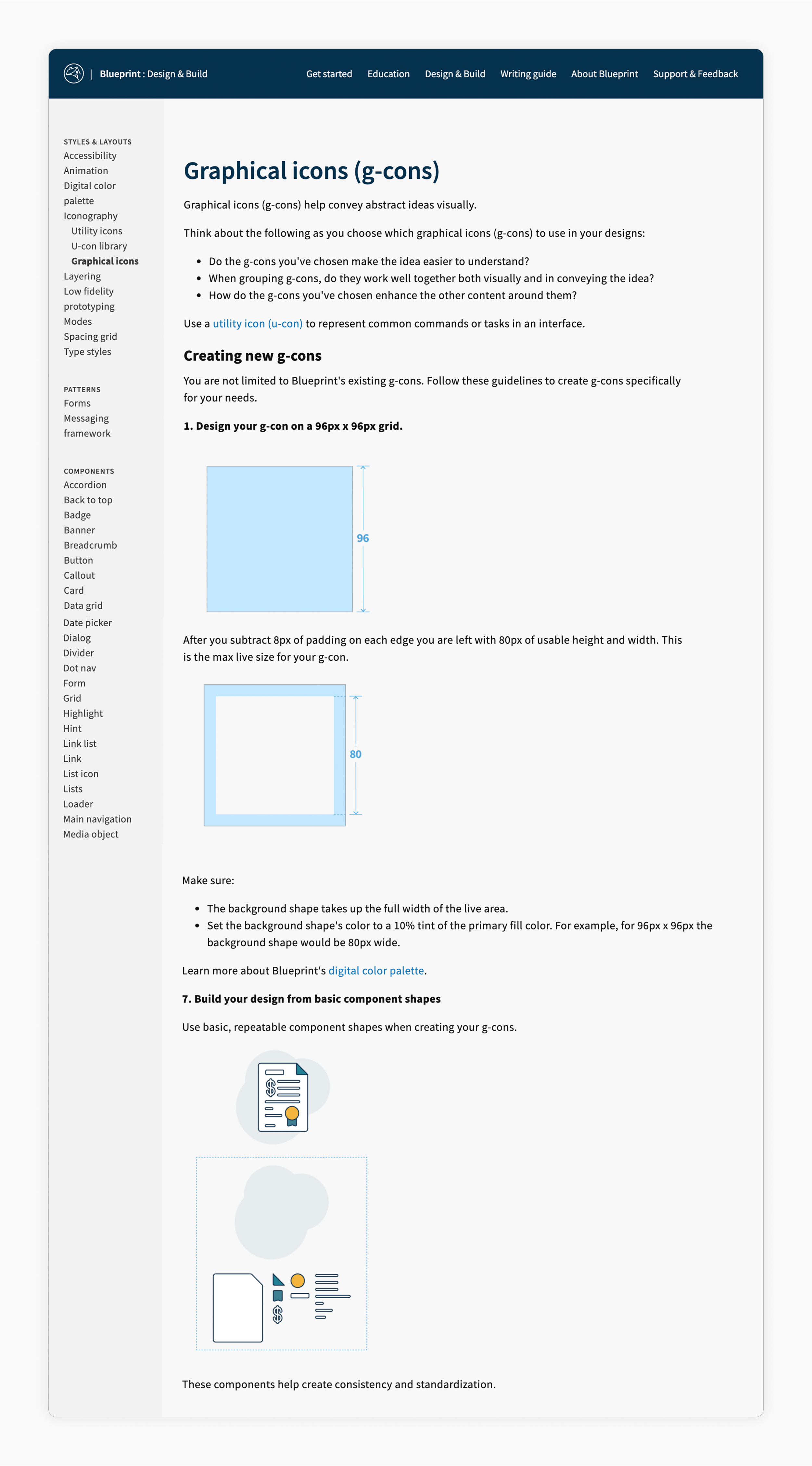
We worked with CXD’s senior content strategist to draft a set of usage guidelines. Our goal was to provide guidance on what g-cons are, how and where they should be used, and how new ones can be created.
Usage guidelines—We also drafted guidelines for Fannie Mae's design system portal.
Next steps
Moving the work forward
🛠️ Testing the existing library
Begin testing the library with CXD designers to gauge overall sentiment and identify additional areas for application.
🗂️ Developing an intake and governance process
Determine an intake process for illustration creation requests and a means of intuitively organizing artwork for designers.
🤝 Encouraging adoption across the enterprise
Get designers to begin using these preliminary icons within their projects.
🌱 Continuing to mature the illustration style
Begin to consider areas and opportunities for larger illustrations and variations on the library such as dark and high contrast modes.

