Patient Feedback Analytics
MVP, UX Research, Sentiment Analysis

Summary
In 2023, I worked with product, engineering, and customer success teams to research and develop a net-new patient feedback analytics MVP. Our goal was to provide health systems—the people and institutions that deliver care to specific populations—with deeper insights into the feedback they collect from patients.
Client
My role
Lead product designer (user interviews, usability testing, wireframing, MVP scoping)
Team
Product director, design director, product manager, two frontend engineers, one backend engineer
Timeline
January 2023 – May 2023
Introduction
Surveying patients about their care experience
A common standardized survey that patients get after receiving care is the Centers for Medicare & Medicaid Services (CMS) Consumer Assessment of Healthcare Providers & Systems (CAHPS) survey.
📝 Survey topics
Healthcare providers
Health plans
Health and drug plans
Etc.
🎯 Feedback goals
Create incentives to improve care quality
Produce comparable data on patient's perspectives
Increase transparency within healthcare to make the public more accountable
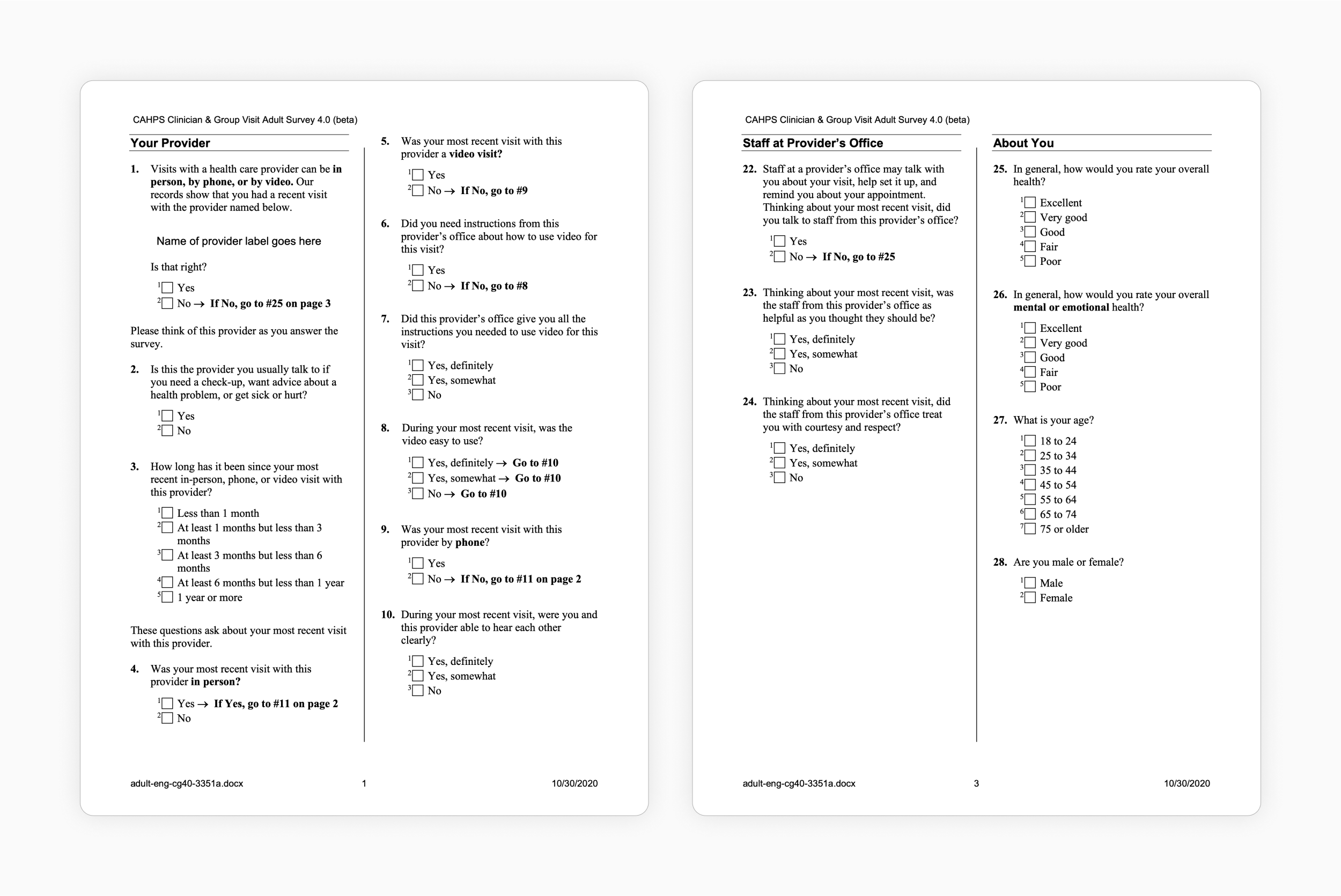
CAHPS survey questions—The CAHPS Clinician & Group Visit Adult Survey asks questions about the patient’s care visit, including timeliness of care, and communication from providers, among other topics.
Context
Addressing health system goals
Loyal’s reputation-management solution, Empower, allows health systems to publish patient ratings and reviews on their provider pages.
🏥 Health system goals
Maintain and manage their reputation
Improve the quality of care they provide
Qualify for certain types of reimbursement
Inform organizational and business decisions
🤒 Patient goals
See what others are saying about a health system’s providers
Make smarter, more informed healthcare decisions
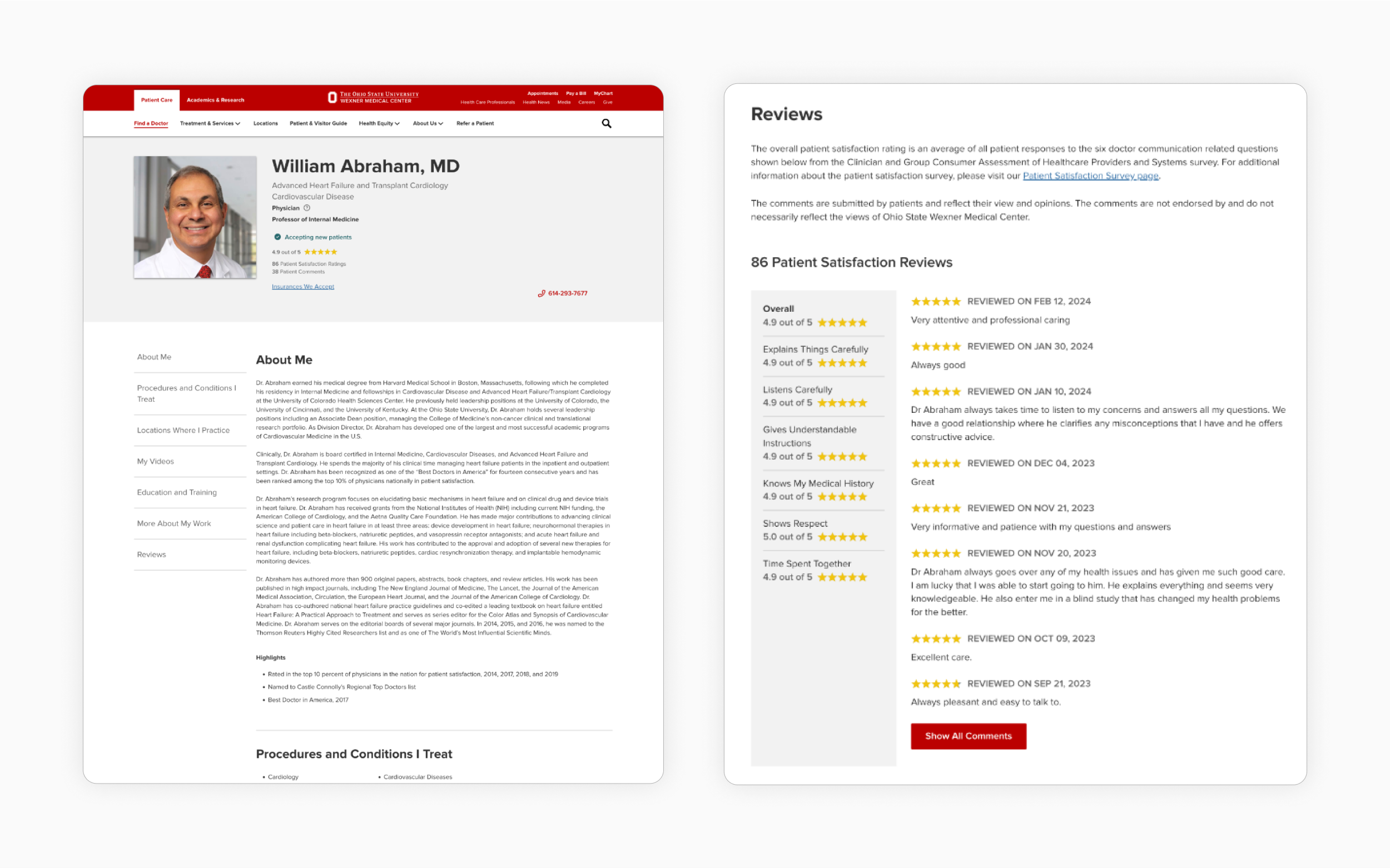
The Ohio State University—A provider page using Empower features an aggregate star rating, total comments, a breakdown of specific feedback categories, and individual ratings and reviews.
Problem
Generating insights into patient feedback
While health systems collect a wealth of qualitative data, they often don’t fully understand what’s influencing patient perception. Our goal was to understand health system goals around feedback collection and allow them to identify, compare, and prioritize insights from this data. Likewise, the tools and processes that health systems use have typically fallen into the following issues:
🛠️ Designed for experts
Health systems use complicated and complex analytics tools that only cater to expert users.
🌱 Lacking insight into root causes
Health systems can’t easily uncover the root cause of these issues.
🌎 Stripped of context
Health systems view massive amounts of feedback data stripped of context or irrelevant to their specific needs.
👀 Lacking insight into issues
Health systems cannot easily identify what issues are occurring and what sorts of patterns might exist in their feedback.
How might health systems benefit from greater, more actionable insight into their patient feedback and how might they use this to accomplish their goals?Hypothesis
Making qualitative data actionable
We hypothesized that by analyzing qualitative patient feedback for information meaningful to them, at the right level of granularity, health systems will be better equipped to:
📣 Generating insights
Surface and prioritize key trends that might merit further attention, require direct intervention, or be suitable for recognition.
💰 Better allocating resources
Make more effective and informed decisions around market resource allocation (time, energy, and revenue) backed by patient feedback data.
📈 Increasing patient retention
Indirectly increase patient retention and attract additional consumers, patients, partners, and employees.
🏃♂️ Taking action
Take action on areas of the patient experience that marketing is responsible for and relay relevant patient feedback to responsible stakeholders.
Process
Gaining insight into user needs
Empower’s product manager and I reached out to users and worked with the customer success team to arrange interviews with 2 to 3 Empower customers. Recruiting users was a challenge given their seniority and availability for testing. Due to our small user pool, we decided to conduct interviews and usability tests of several analytics dashboard concepts.
📝 Semi-structured interviews
Understand:
What information users find most valuable, least valuable, and why
What type of segmentation and granularity are most useful to users and why
What users do with this information and why
⚙️ Usability tests
Understand:
How users currently leverage patient feedback
What kinds of decisions users are trying to make with this feedback
What users could do well, not well, or not at all
What specific information or insights might be most valuable
Low-fidelity wireframes—To move quickly, we used low-fidelity wireframes to test what types of information were most important to users, how that information might be used, and how it could best be presented to users visually.
Findings and outcomes
Establishing design principles to guide the analytics platform
Our research confirmed areas of our original hypothesis and revealed several other secondary considerations. From this, we distilled the following design principles:
💡 Relevant
Show the most important, relevant information that allows the user to easily achieve their goals.
👀 Transparent
Surface what this information is and where it comes from.
🔗 Unifying
Bring all information under one roof and centralize different data sources in one place.
✅ Accessible
Cater to non-technical users (healthcare and marketing experts) by contextualizing the data and using plain language.
🏎️ Actionable
Use data to highlight what’s working and what’s not working across the organization so that it can be acted upon.
🔬 Discoverable
Provide at-a-glance information that users can use to drill down into to discover patterns.
Key features
Highlighting key trends and insights
📊 Analytics groups
Health system
Individual locations
Aggregate and individual providers
Aggregate and individual categories
Individual comments—Users can view feedback left by patients. These comments, if approved, also appear publicly on provider pages.
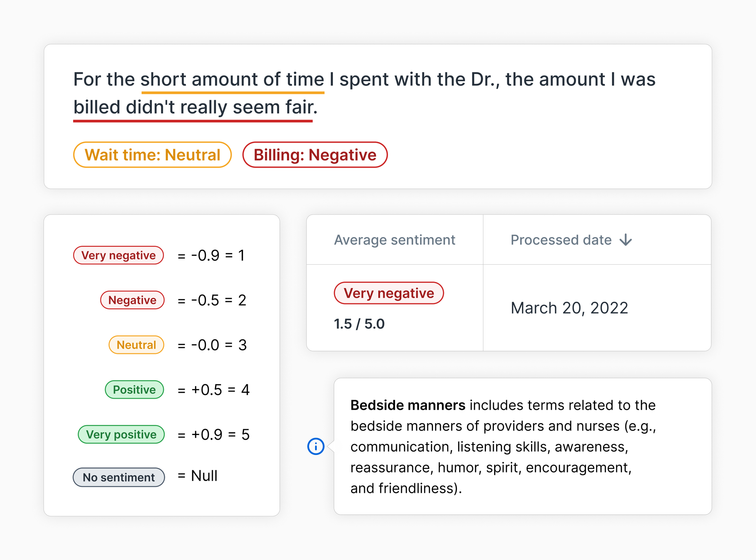
Comment-level
Analyzing individual comments
Our MVP leveraged aspect-based sentiment analysis, identifying how positively or negatively a patient felt about their experience.
✅ Goal
Understand how positively or negatively patients felt about the overall care they received
See which aspects of their care they felt positively or negatively about
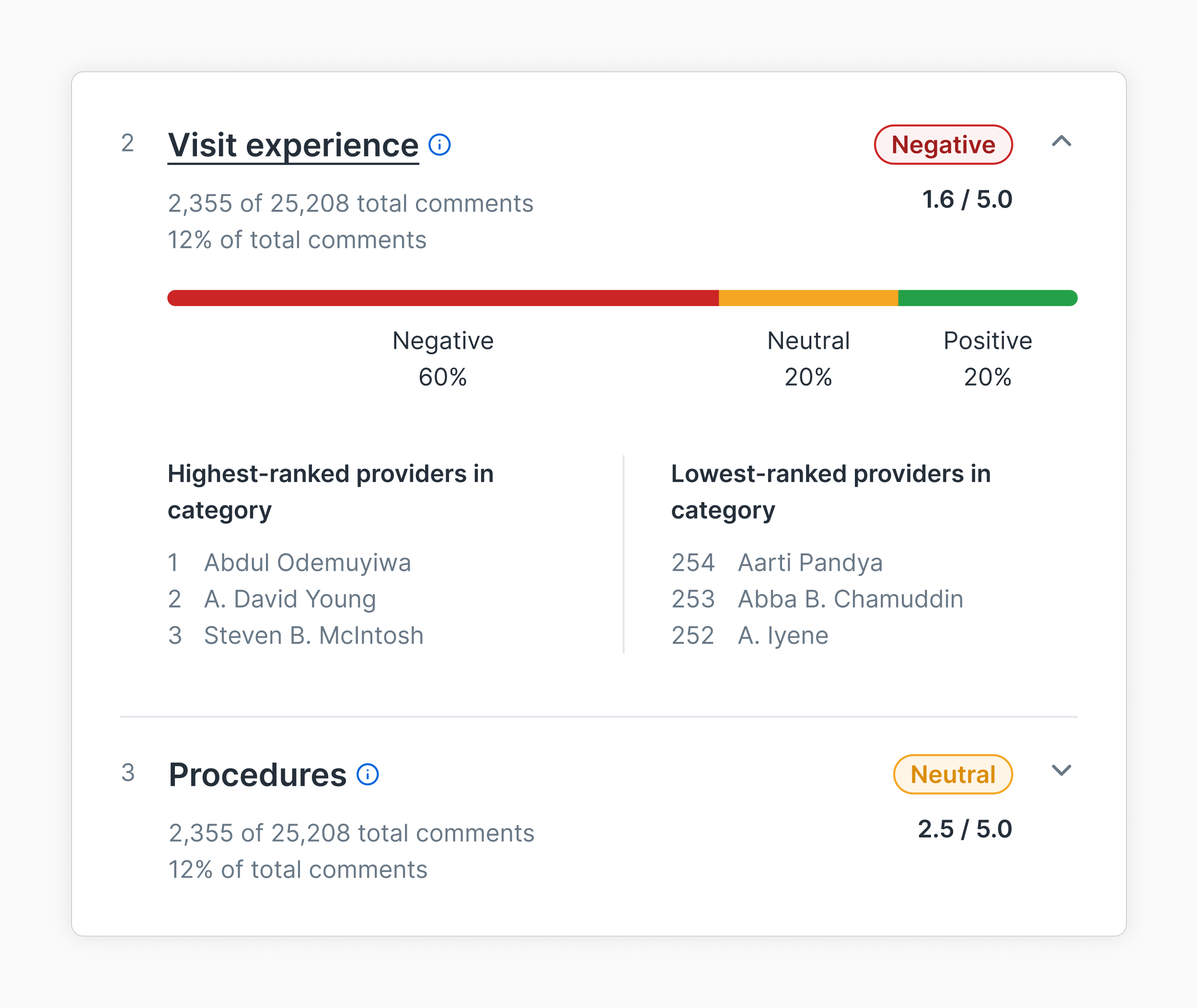
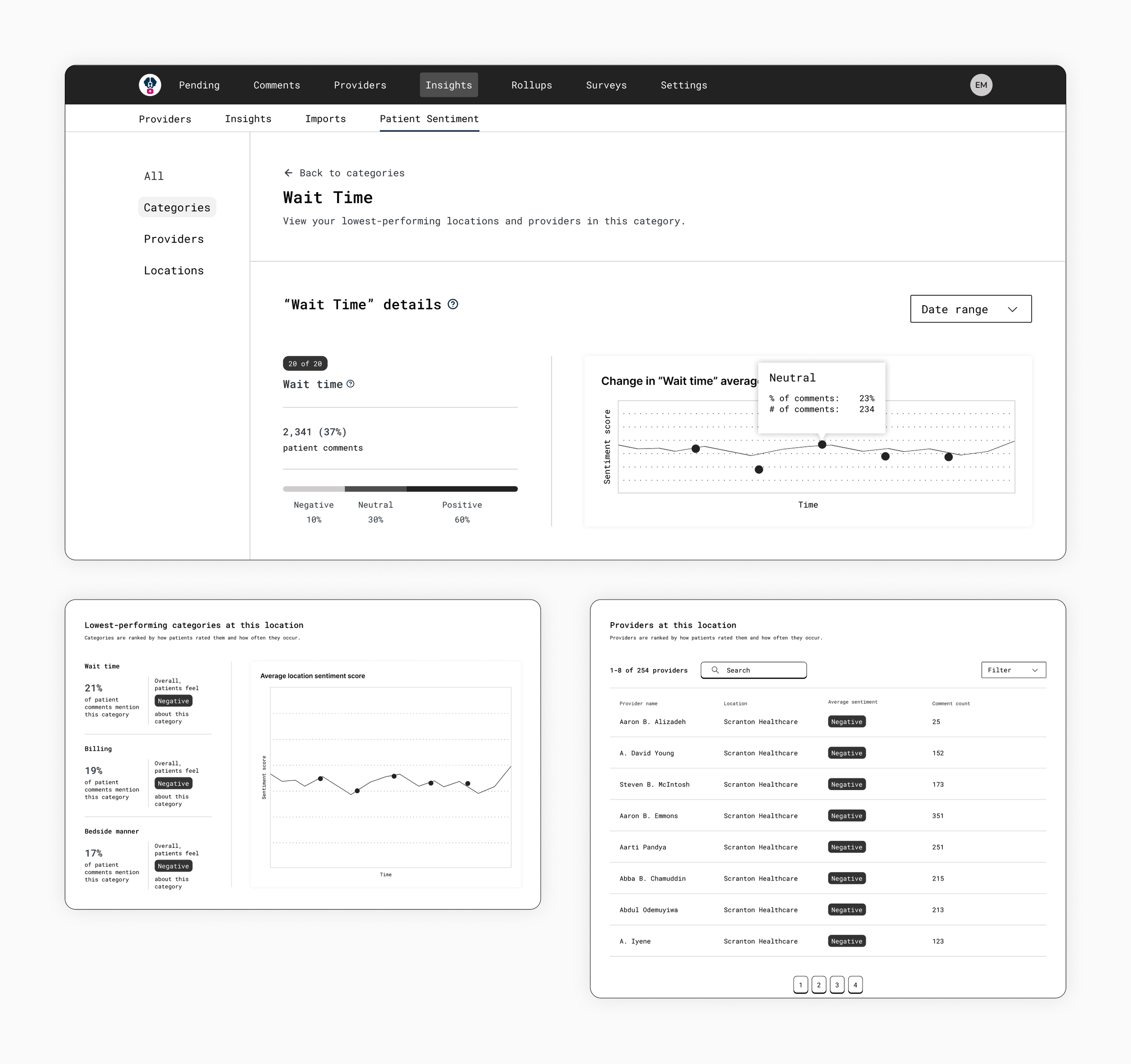
Aggregate category list—The goal was to showcase high-level category trends, helping health systems know where to focus their attention.
Category-trends
Analyzing category trends
This type of analysis identified aspects or specific patient experience categories that patients mentioned in their reviews.
✅ Goals
See how a specific category scored on average
See the distribution of positive and negative reviews
See the percentage of comments that mention a category
Understand which providers performed highest and lowest in that category
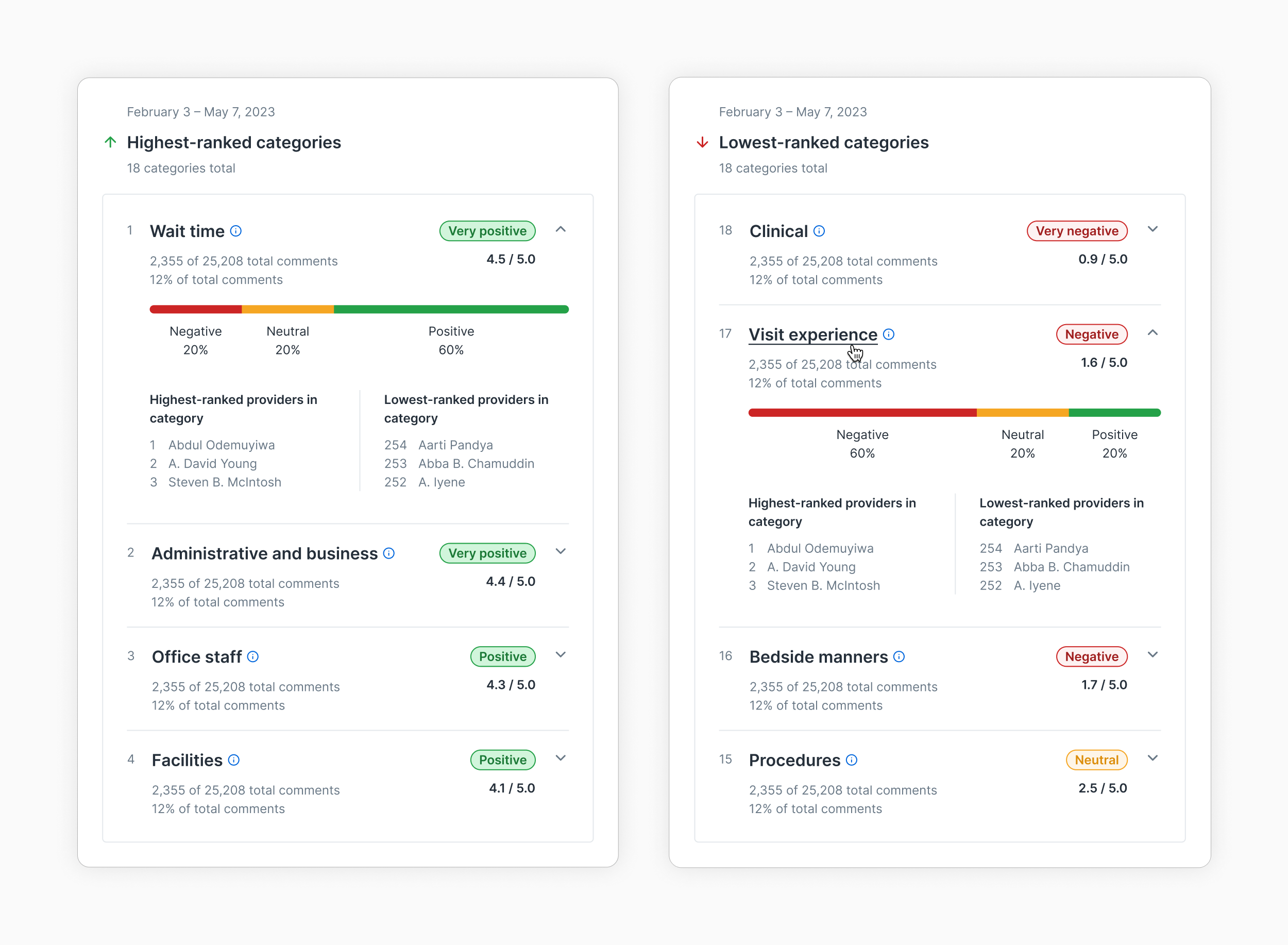
Ranked categories list—This ranked category list shows the three highest-rated categories at a given health system during a specific date range. It allows users to get an overview of category performance while drilling down for more detail.
Category-rankings
Comparing and ranking categories
Highest- or lowest-ranked categories allowed health systems to know where to focus their efforts.
✅ Goals
Understand which categories were performing highest and lowest overall
See how individual categories compare to one another
Prioritize, investigate further, or attempt to address specific categories
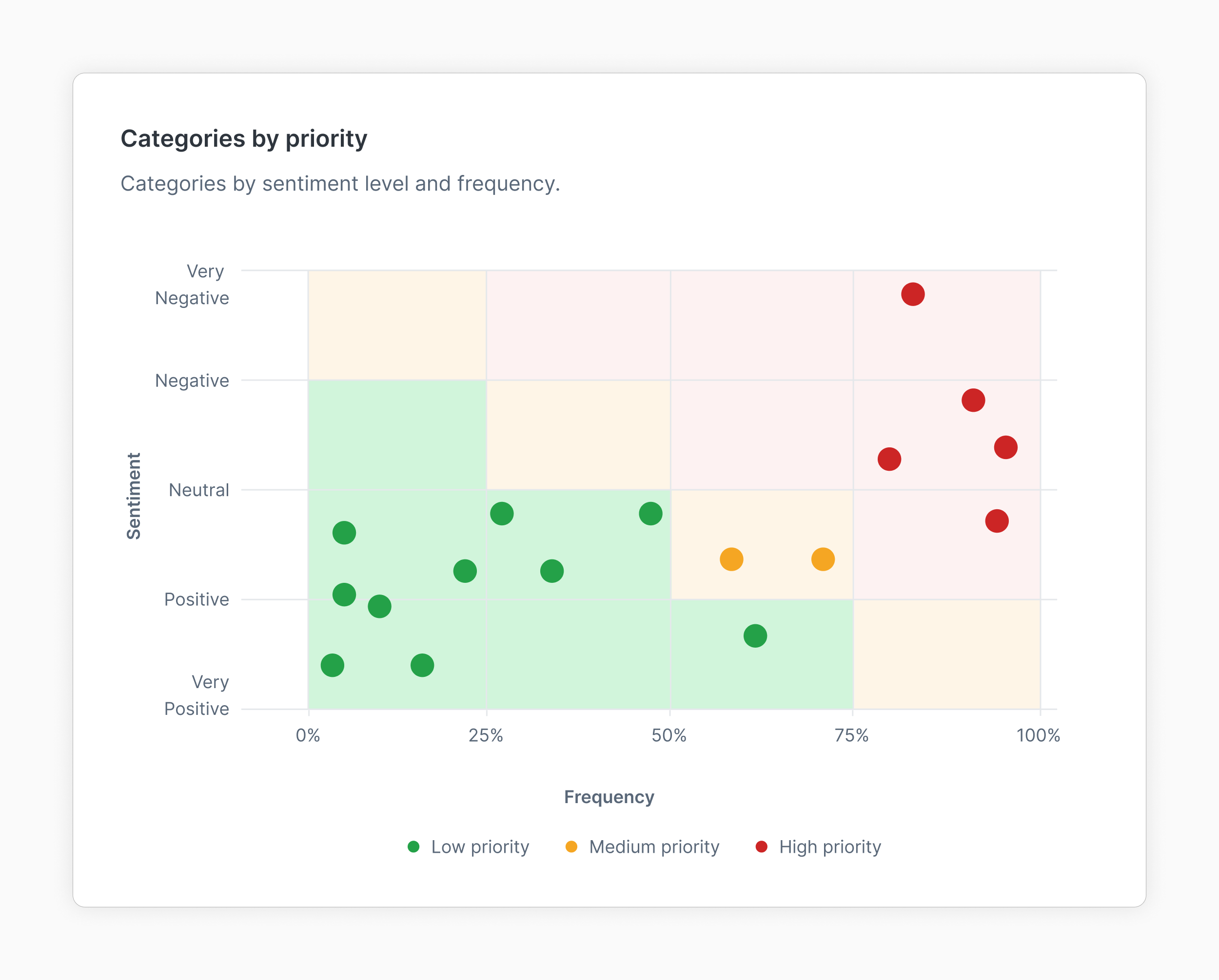
Categories by priority—We used a scatterplot to prioritize categories. These were measured by how often a category was mentioned and how positive or negative it was evaluated.
Data visualizations
Highlighting trends visually
There were opportunities for visuals, charts, and other graphs to help communicate a sense of urgency in another way.
✅ Goals
Visually gauge the performance of categories relative to one another
View outliers in performance
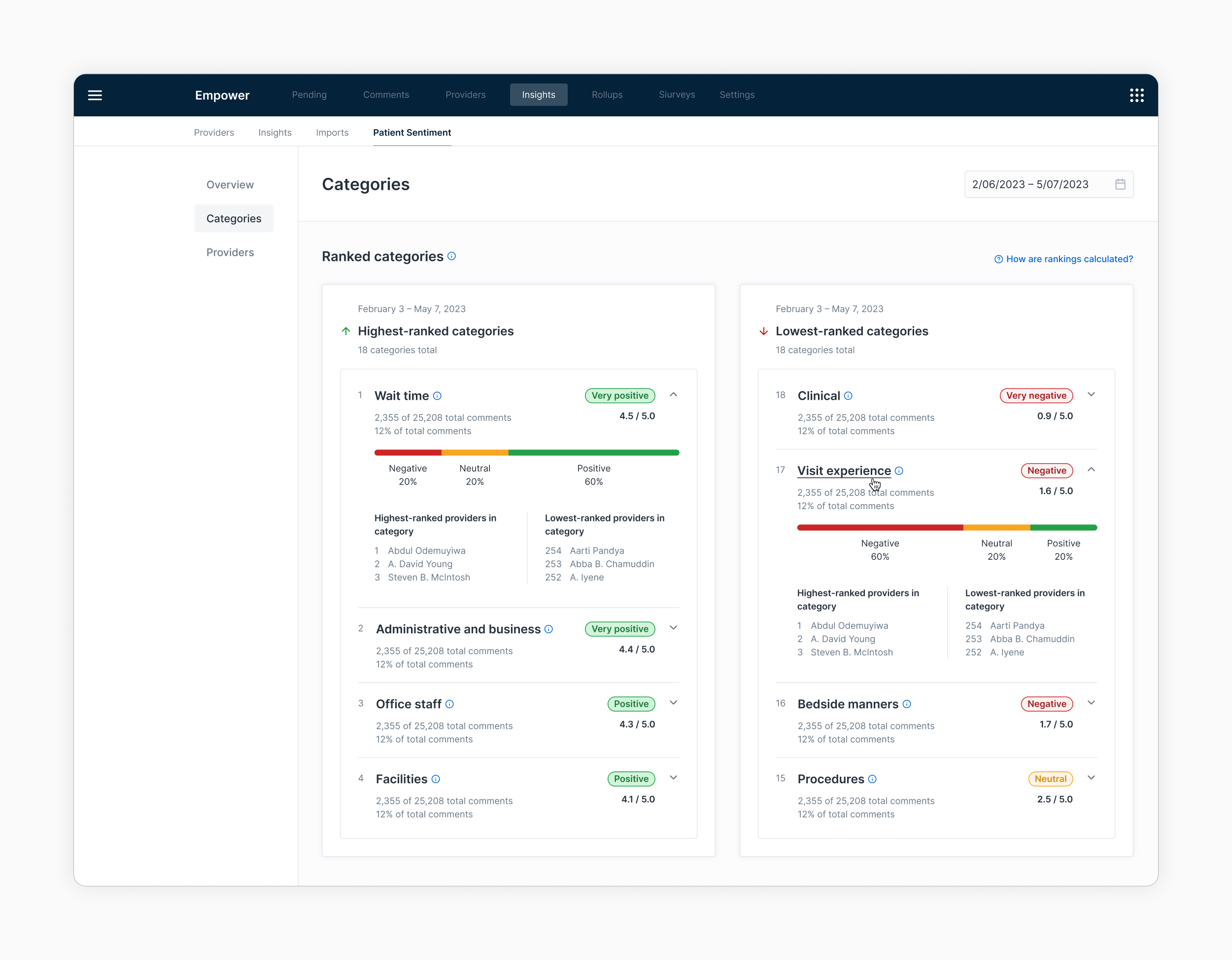
Analytics dashboard—The dashboard served as a jumping-off point for different data types, whether at a health system level, comment categories, or providers.
Analytics dashboard
Viewing data at different levels
We wanted to provide users with a way to easily identify high-level trends and then be able to drill down to view more detail or get more specific insights into why a category or provider was performing a certain way.
✅ Goals
Drill down into different sections of data depending on what their needs were
Easily access more detailed levels of the dashboard up-front
Considerations
Applying NLP in the healthcare space
💻 Limitations of survey data
Analytics are only as useful as the feedback that’s captured. CAHPS surveys only cover one part of the patient experience. The feedback is typically analyzed months later, making it difficult to address issues in real-time.
✨ Expanding into other feedback areas
There are opportunities to incorporate and analyze other types of feedback, allowing for a 360-degree view of what patients are saying.
🎯 Addressing accuracy concerns
Several users expressed concerns about the accuracy of the comments (how they were rated and identified). Several of them still preferred to review comments manually.