MyServices
Resource Portal
Usability, Accessibility, Information Architecture
Summary
The MyServices Portal is Fannie Mae’s internal resource hub for its 7,500+ full-time employees and contractors. Over three months, Fannie Mae’s Customer Experience Design (CXD) team partnered with product owners on the MyServices team to address the usability, accessibility, and organizational needs of the platform.
Client
My role
Primary product designer (heuristic evaluation, wireframing, prototyping, and usability testing)
Team
Two product designers, five heuristic evaluators, one design strategist, and one content strategist
Duration
October 2020 – December 2020
Problem
Addressing usability and accessibility issues
🎯 Major pain points
An overall inconsistent user experience
A lack of discoverability into portal content
Irrelevant search and filter functionality
Stakeholders on the MyServices team originally reached out to CXD that users were having a difficult time locating and accessing information relevant to them. At the same time, stakeholders were finding it difficult to organize and manage content.
How might we make the MyServices Portal easier for employees search and more flexible for product stakeholders to manage?Process
Defining the scope of the engagement
We scoped and prioritized the work ahead and then shared it with stakeholders for feedback.
🛠️ Defining the work
We determined the scope of the engagement, reviewed stakeholder requirements, identified potential areas for improvement, and developed a set of metrics to measure success once the work had been completed.
⏰ Meeting with stakeholders
We prioritized requirements and opportunities for improvement based on the level of effort, the potential for impact, stakeholder input, and CXD’s available time and resources.
Research
Establishing a research baseline
🔬 Conducting a heuristic evaluation
We conducted individual heuristic evaluations on a representative sample of portal pages for comparison against current industry standards and best practices. This standard evaluation also lent credibility to CXD and supported other recommendations we would provide in the future.
Heuristic evaluation—We rated each heuristic standard on a scale from 0–3 (adapted from Nielsen Norman’s 10 Usability Heuristics for User Interface Design), aggregated the results, and used these ratings to prioritize which areas to focus on within the platform.
✨ Revising the information architecture
Content strategists on the team led a card-sorting activity with portal users. To help with discoverability, we wanted to determine if navigation was intuitively organized and used labels that users expected. We ran through several revisions of the secondary-level navigation classification.
Card sorting—We renamed certain primary- and secondary-level navigation links and relocated them to better align with users’ expectations.
Findings
Focusing on high-impact and high-visibility areas
🎯 Priority areas
Site navigation
Search and filtering functionality
Outstanding tasks
We presented our heuristic evaluations and desktop research findings to the MyServices team.
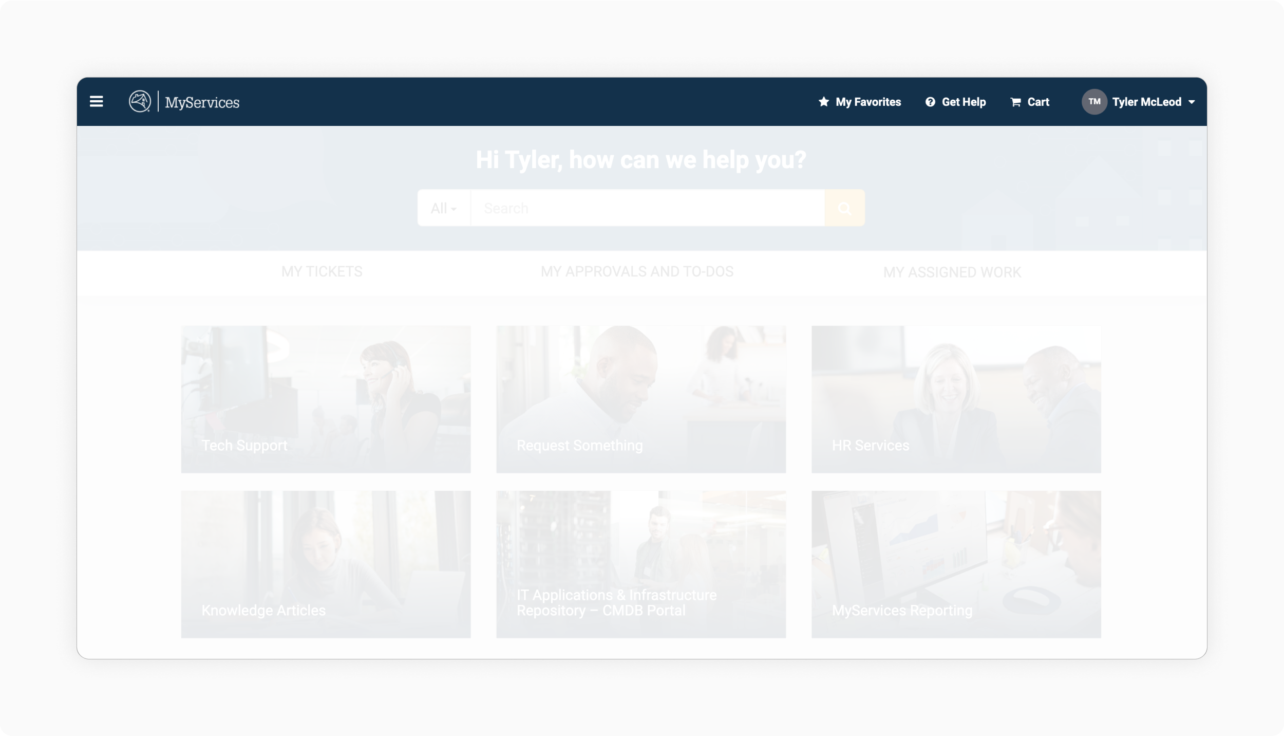
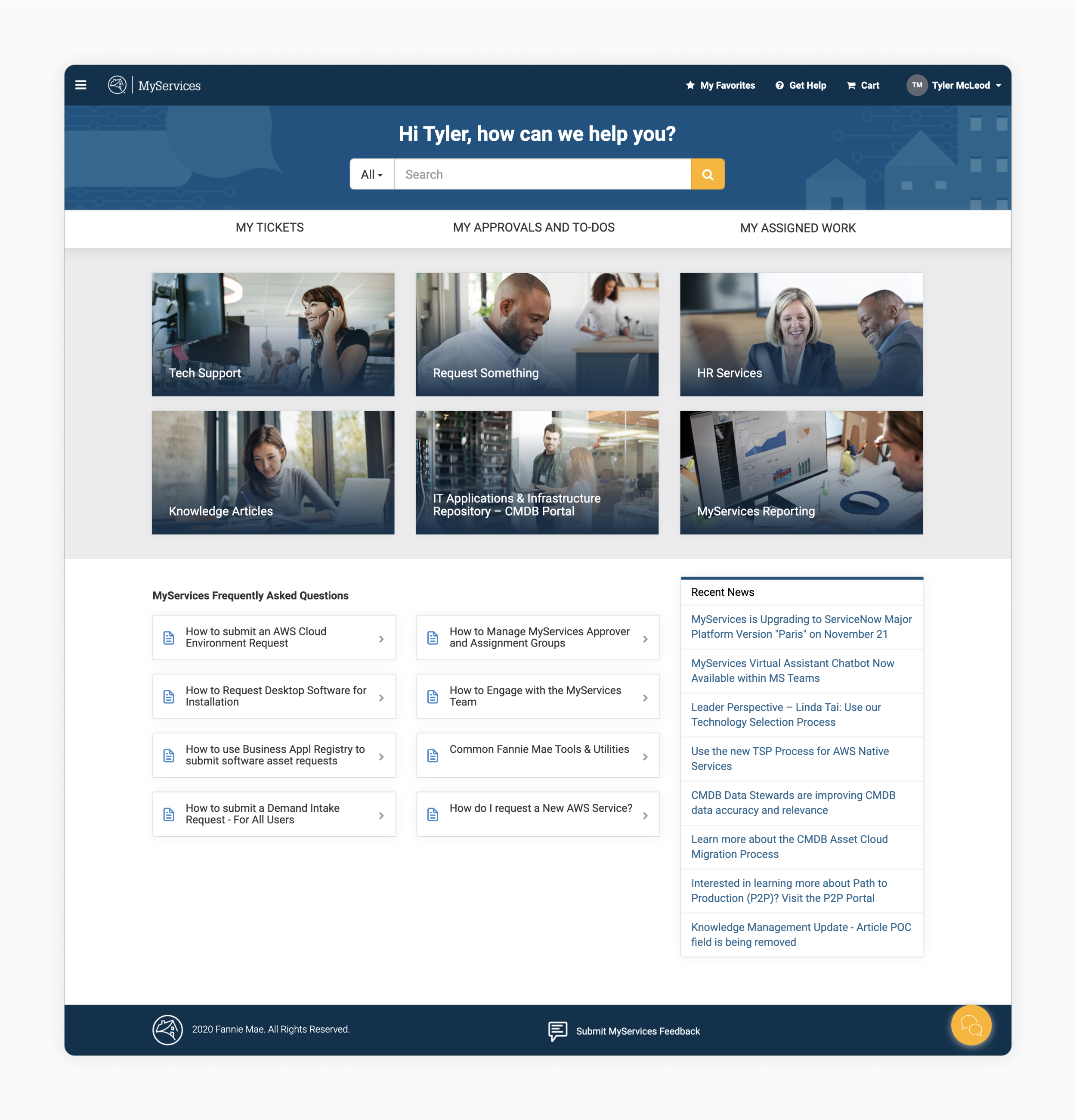
MyServices navigation—The hidden navigation elements saved space but made it more difficult for users to access the information they needed.
Site navigation
Hidden and inflexible navigation
🔎 Findings
The portal hid primary navigation items within a hamburger menu in an unclear and unorganized manner.
It wasted valuable real estate on the homepage and provided no additional value.
It was also inflexible and could not easily accommodate future additions to the portal.
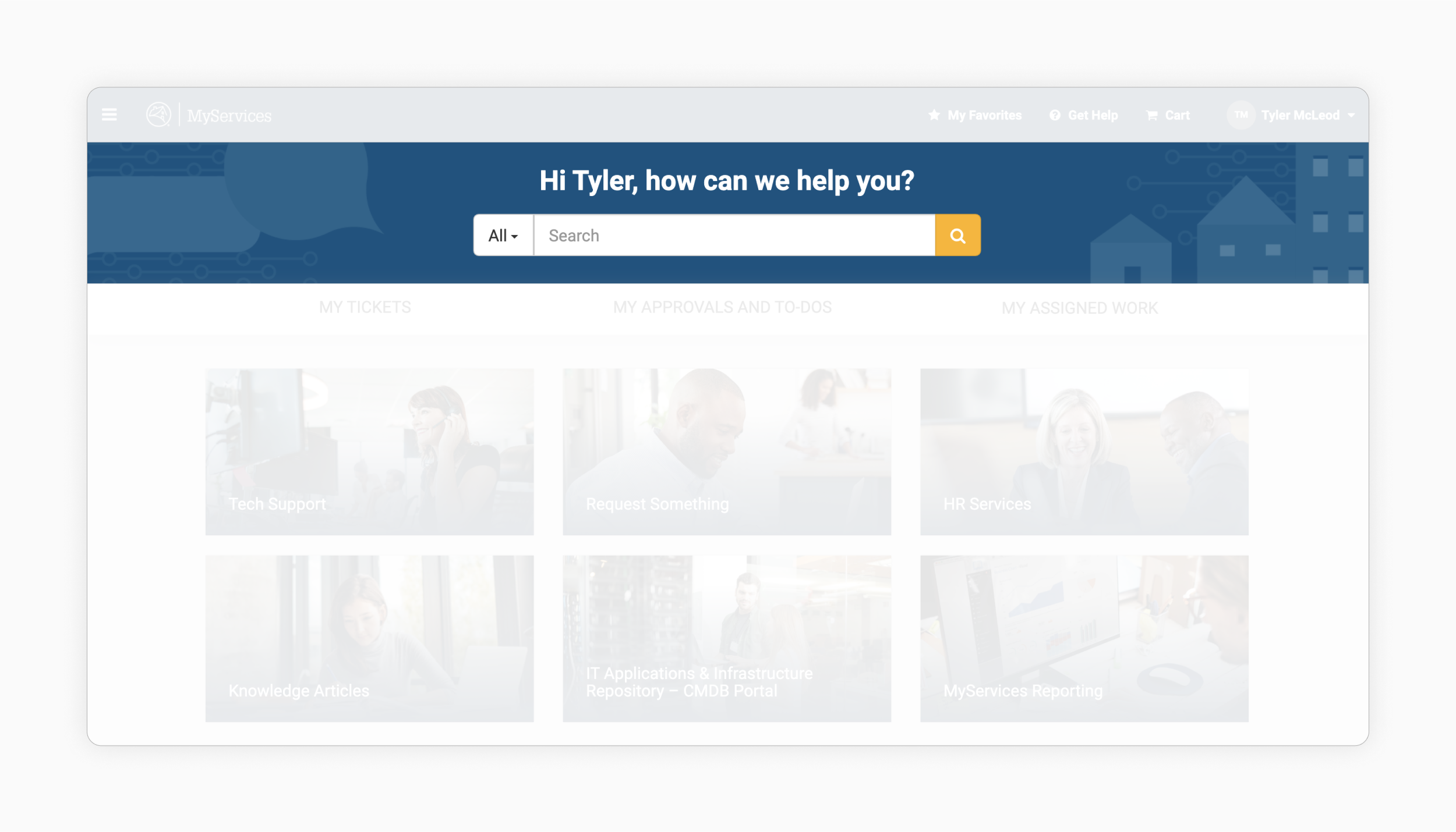
MyServices search—The filter option within the search bar was not used consistently across the site and did not provide any additional value when first entering a search.
Searching and filtering
Inconsistent and complicated search experience
🔎 Findings
The portal’s search functionality was inconsistent across the portal.
It provided overly complicated or irrelevant filter options.
It provided additional functionality that users either did not notice or did not use.
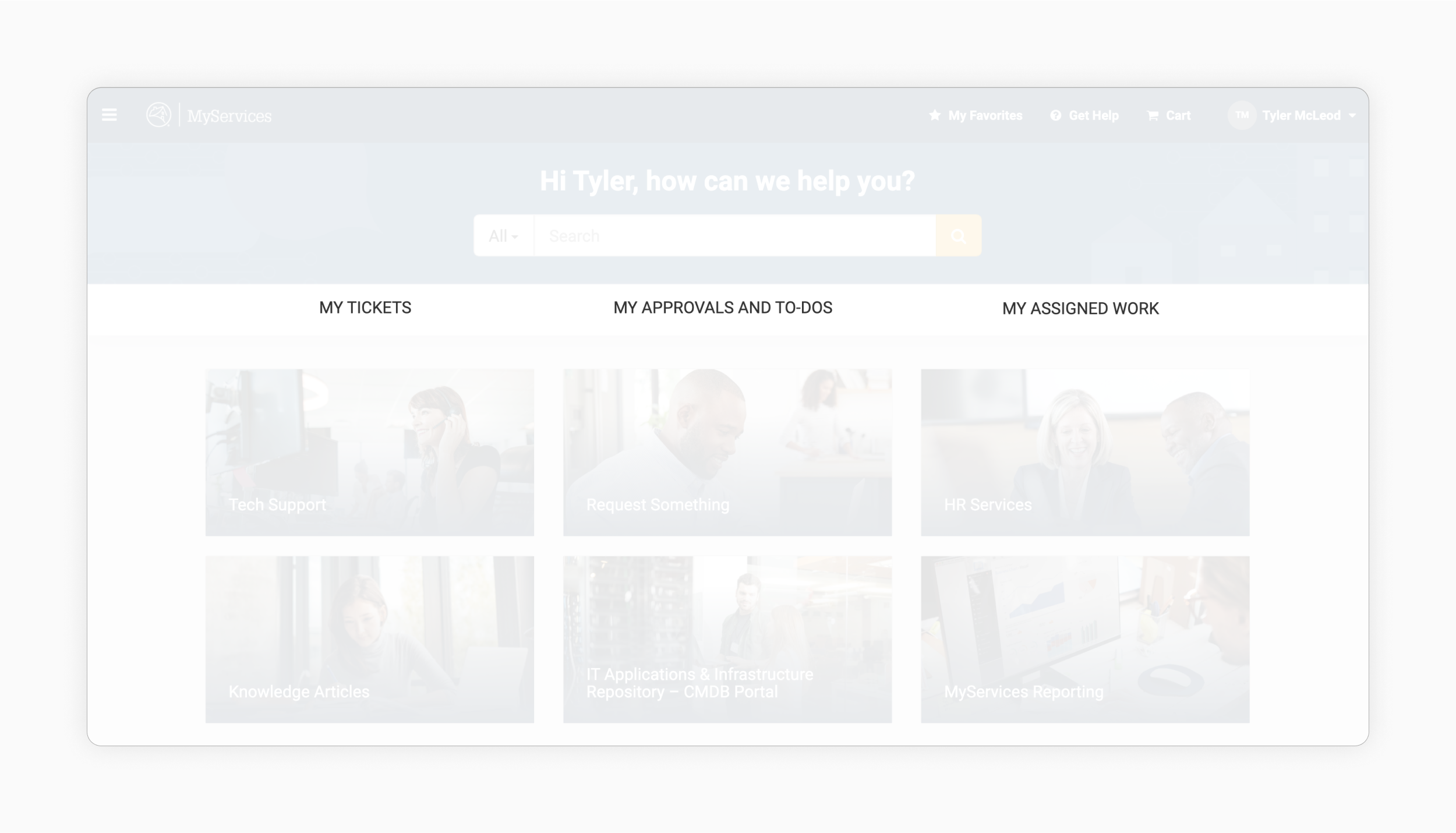
Tasks, tickets, and assignments—While these navigation items served as helpful shortcuts to these portal sections, they didn’t help users know where to take action.
Outstanding tasks
Low task status visibility
🔎 Findings
The portal provided very little at-a-glance information about outstanding tasks.
It did not clearly communicate the status of any outstanding tasks.
It also redirected users to other portions of the overall platform.
Main solutions
Creating a more flexible, intuitive, and usable portal
🎯 Objectives
Allow users to locate and navigate to the resources they need
Enable stakeholders to easily and flexibly manage content
Align the portal to Fannie Mae’s design system, Blueprint
Homepage before—While the previous homepage highlighted several key underlying areas of the portal, the homepage could have been better utilized for dynamic content and functionality relevant to new and returning users.
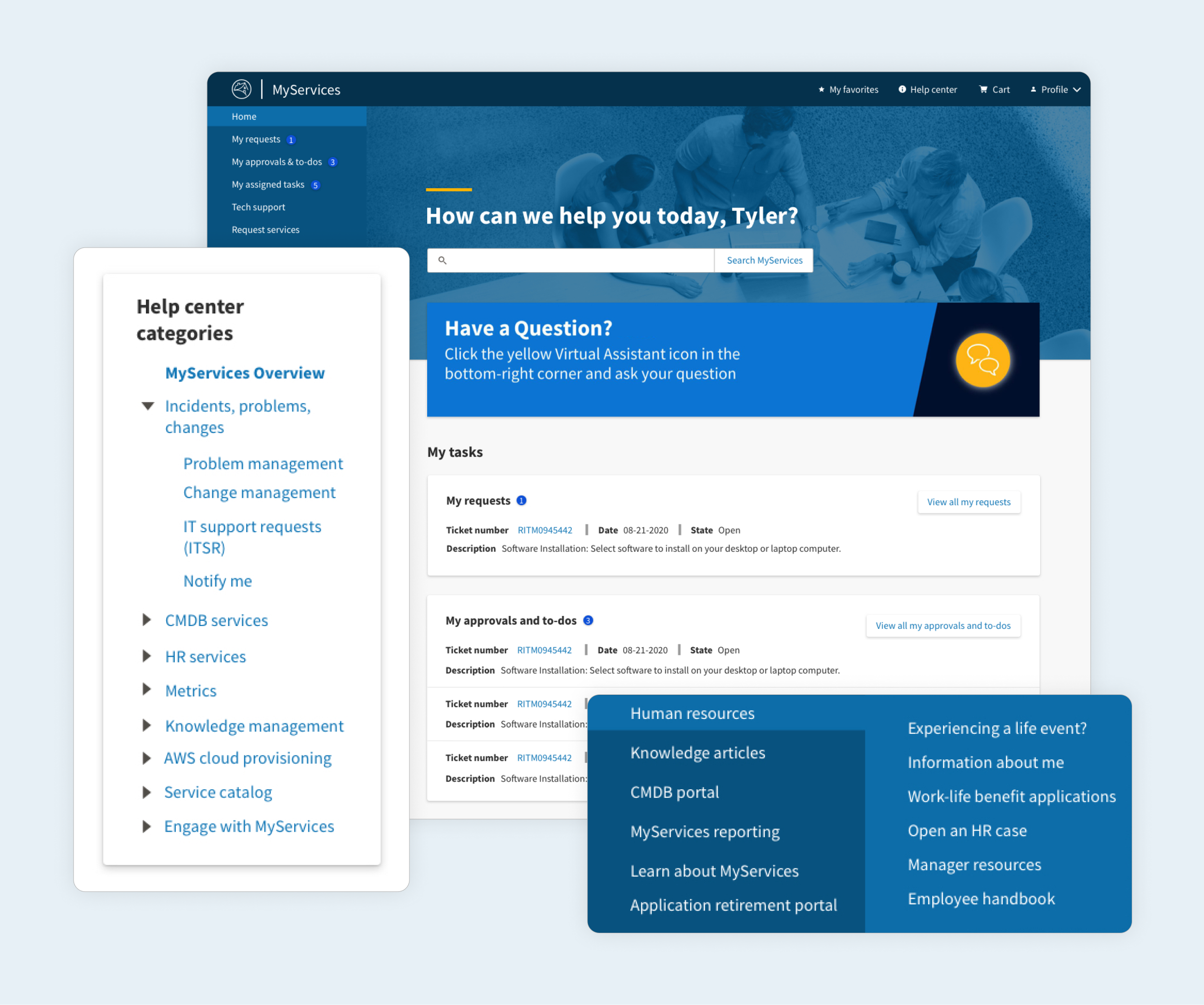
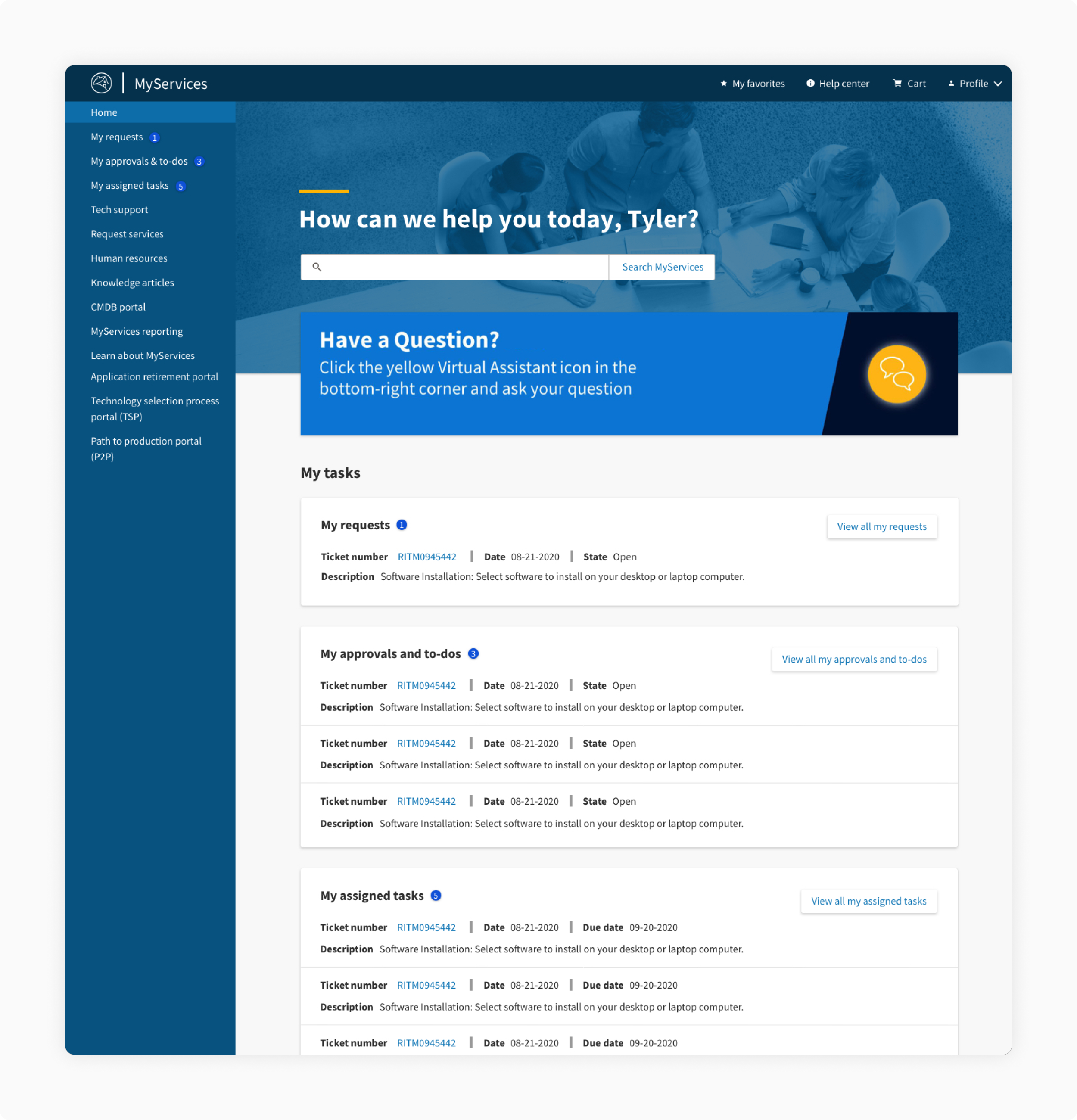
Homepage after—The revised homepage features a vertical, scalable navigation that allows users to scan key links. It also highlights time-sensitive, task-related information to users.
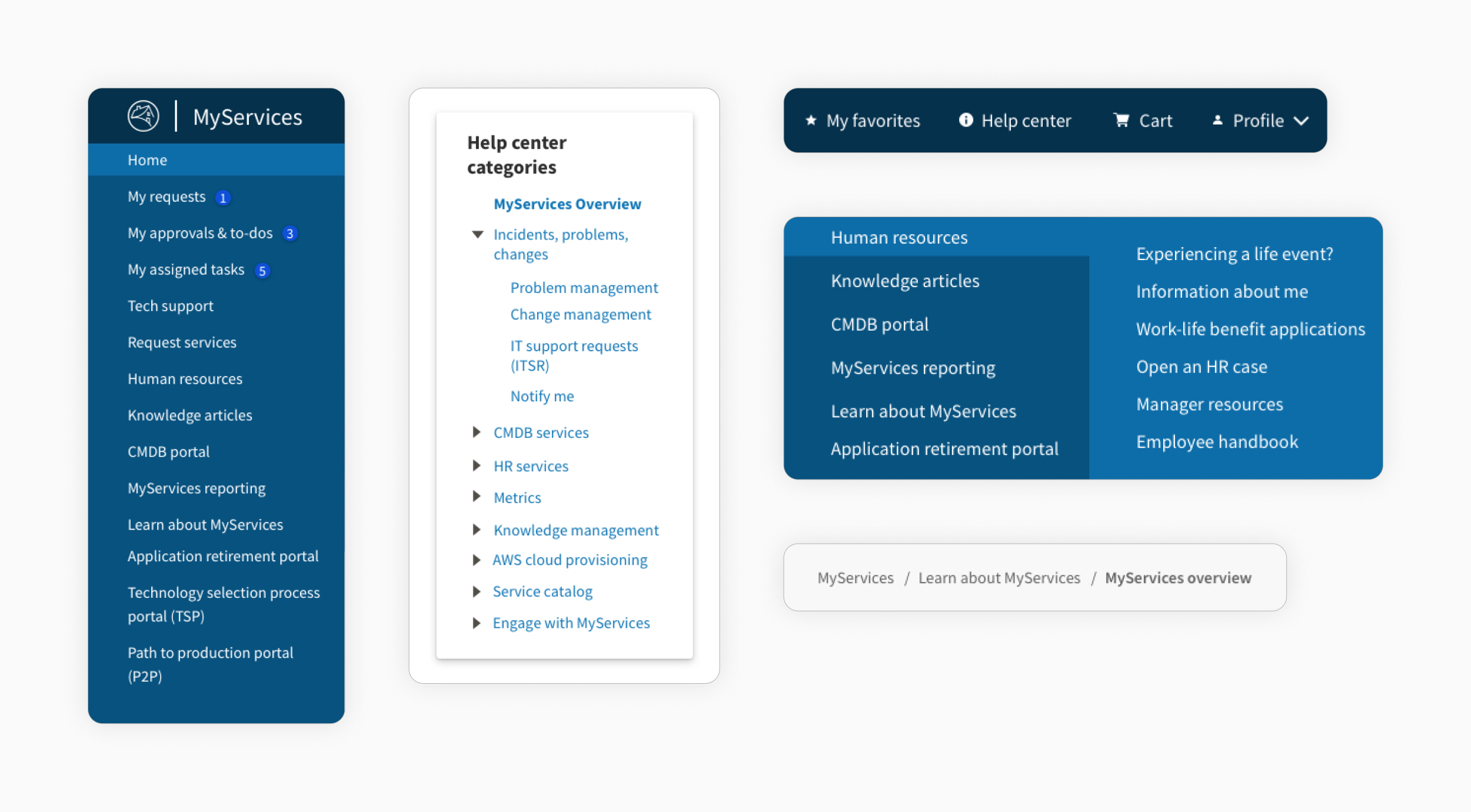
MyServices navigation—We decided to opt for a vertical navigation component to make the primary level more easily scannable. We also placed requests, approvals & to-dos, and assigned tasks first for easy access.
Navigation
Making navigation more visible and flexible
✅ Recommendations
Surfacing navigation hidden within the hamburger menu to highlight options for users
Developing a new navigation pattern that frees up space for more relevant homepage content
Ensuring navigation is flexible enough to accommodate additional navigation items in the future
MyServices tasks—We surfaced these three task types on the portal homepage to reduce the levels needed to access it. We also provided more at-a-glance information and links to specific tickets upfront.
User tasks
Highlighting key user tasks
✅ Recommendations
Surfacing the most recent or relevant tasks
Linking to an associated ticket’s number
Indicating the number of outstanding tasks
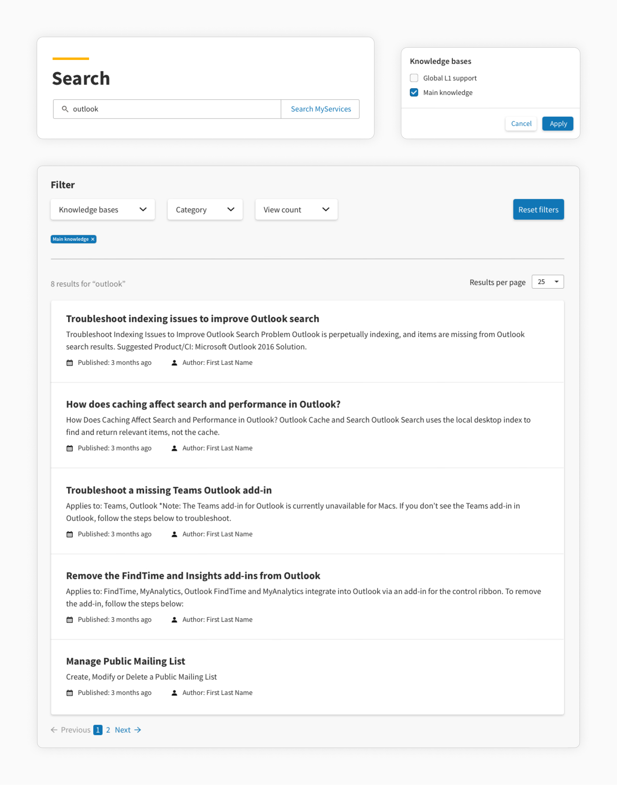
MyServices search and filter—We simplified and consolidated search and filter functionality so it was consistent across the portal and clearer which sections were being searched.
Search and filtering
Streamlining search and filter functionality
✅ Recommendations
Improving consistency of search and filtering functionality across the portal
Determining how users search for information through usability testing
Simplifying the search process by removing extraneous filter functionality
Learnings
Balancing time and resources with impact
🏅 Prioritizing high-impact areas
Given the tight timeframe, our initial wireframes were developed primarily from preliminary desk research. We supplemented that with what we gathered from our heuristic evaluations and from the stakeholder requirements we received.
🔬 Conducting research earlier in the process
Conducting additional user research earlier in the process would have been extremely helpful, allowing us to identify users’ pain points and justify the solutions we developed.
⚖️ Determining realistic deliverables and balancing scope
With such a large undertaking, this was a prioritization exercise. Determining where our team could make the greatest impact given the constraints was a constant challenge.
