DUS360 Platform
Accessibility Improvements, Stakeholder Engagement, Prototyping
Summary
In 2020, Fannie Mae’s Customer Experience Design (CXD) team partnered with key stakeholders from the company’s Multifamily Division. As part of a large engagement effort, I worked with a team of close to 100 subject matter experts, developers, and other designers on a digital solution addressing a forecasted increase in forbearance requests due to the economic impacts of COVID-19.
Client
My role
Product designer (wireframing, prototyping, usability testing)
Team
One product designer, one design strategist, and one design manager
Timeline
July 2020 – September 2020
Problem
Addressing an unprecedented number of forbearance requests
Fannie Mae’s Multifamily Division needed to implement significant changes to its existing forbearance system. This was to handle an anticipated record number of forbearance (an agreement between a lender and a borrower to delay a foreclosure) requests during COVID-19. Historically, this process involved numerous steps, lacked robust automation, and was distributed across several unintegrated legacy systems.
Goals
Increasing overall efficiency and ease of use
Our primary goal was to make it easier for platform users—Special Asset Management (SAM), 3rd-party asset managers, and Servicers—to manage and track forbearance requests.
🔍 Identifying user needs
Our users’ main goals were to:
Manage their forbearance cases
Track required data and documents
Assign tasks
Order and track reports
Initiate and negotiate modification requests
📈 Improving on proposed solutions
We reviewed user stories and requirements drafted by the development team to identify:
Improvements to existing functionality
Areas for additional improvement
Naturally, we received pushback on several of our recommendations due to time and resource constraints.
🔄 Iterating quickly and often
Given the quick turnaround, we:
Created low-fidelity, annotated wireframes in Balsamiq to communicate our proposed changes.
Used an existing component-based framework that developers were using to update the platform.
💬 Maintaining open communication
Throughout the engagement, we:
Sat in on daily standups for situational awareness
Attended PI planning meetings and retrospectives
Met with issue experts and developers for additional context and technical support
Process
Focusing on integrating with the team
We wanted to get up to speed with stakeholders, engineers, and product managers as quickly as possible.
🏎️ Getting up-to-speed quickly
In addition to the massive scope, quick turnaround, and high-profile nature of the engagement, CXD was brought in with little heads-up. One of the biggest challenges involved getting up-to-speed on a complex, mortgage-industry issue in a relatively short amount of time.
⏱️ Prioritizing limited time and resources
With funding for only two designers, we also had to be strategic about where to focus our efforts so we could make the largest impact.
✨ Demonstrating the value of UX
As we began learning about the problem space, we also had to identify areas where we could provide value from a user experience perspective as well as continue to gain buy-in with a partner we had not yet worked with.
Solution
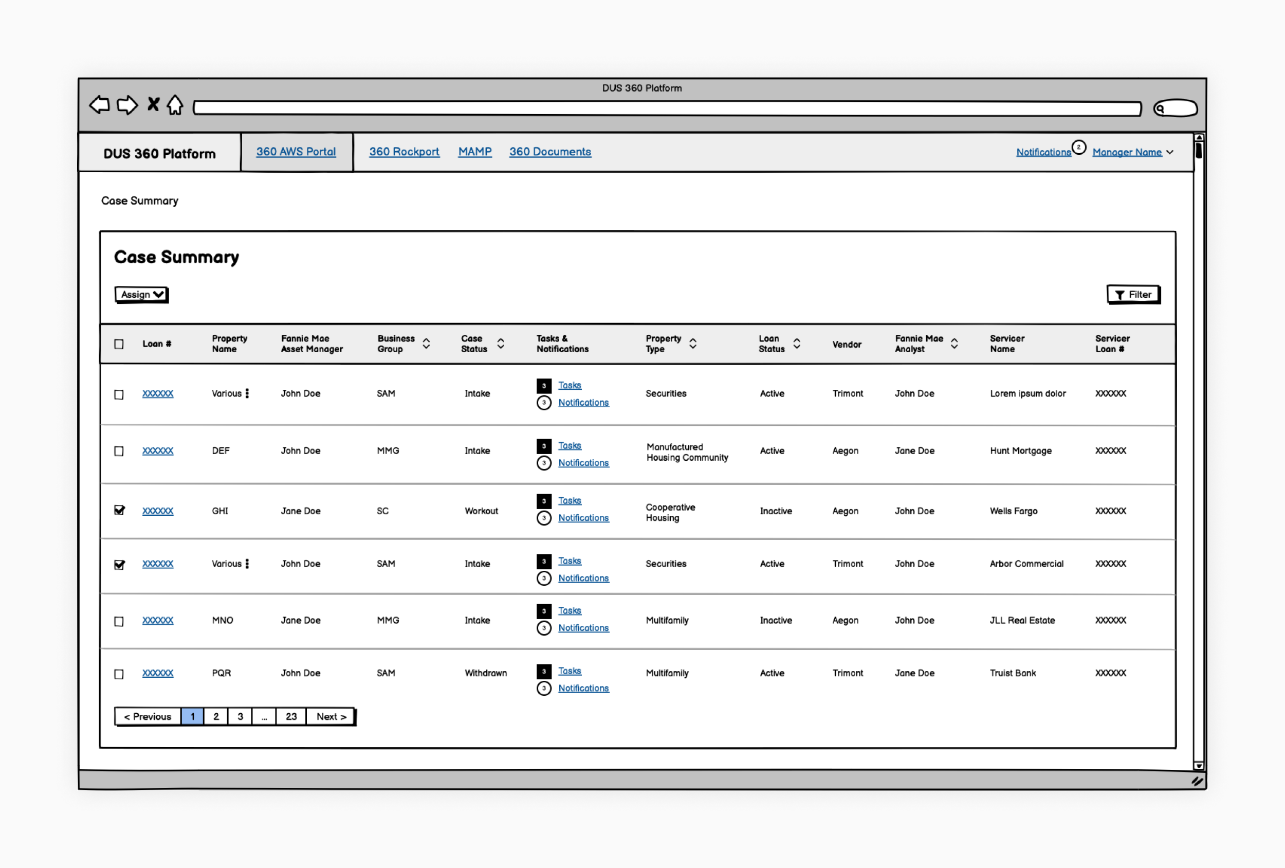
Improving the Case Summary View
This heavily trafficked dashboard displayed an at-a-glance view of loan cases within the DUS360 Platform.
🛠️ Main use cases
Quickly check the status of those cases
Monitor any notifications for cases in this list
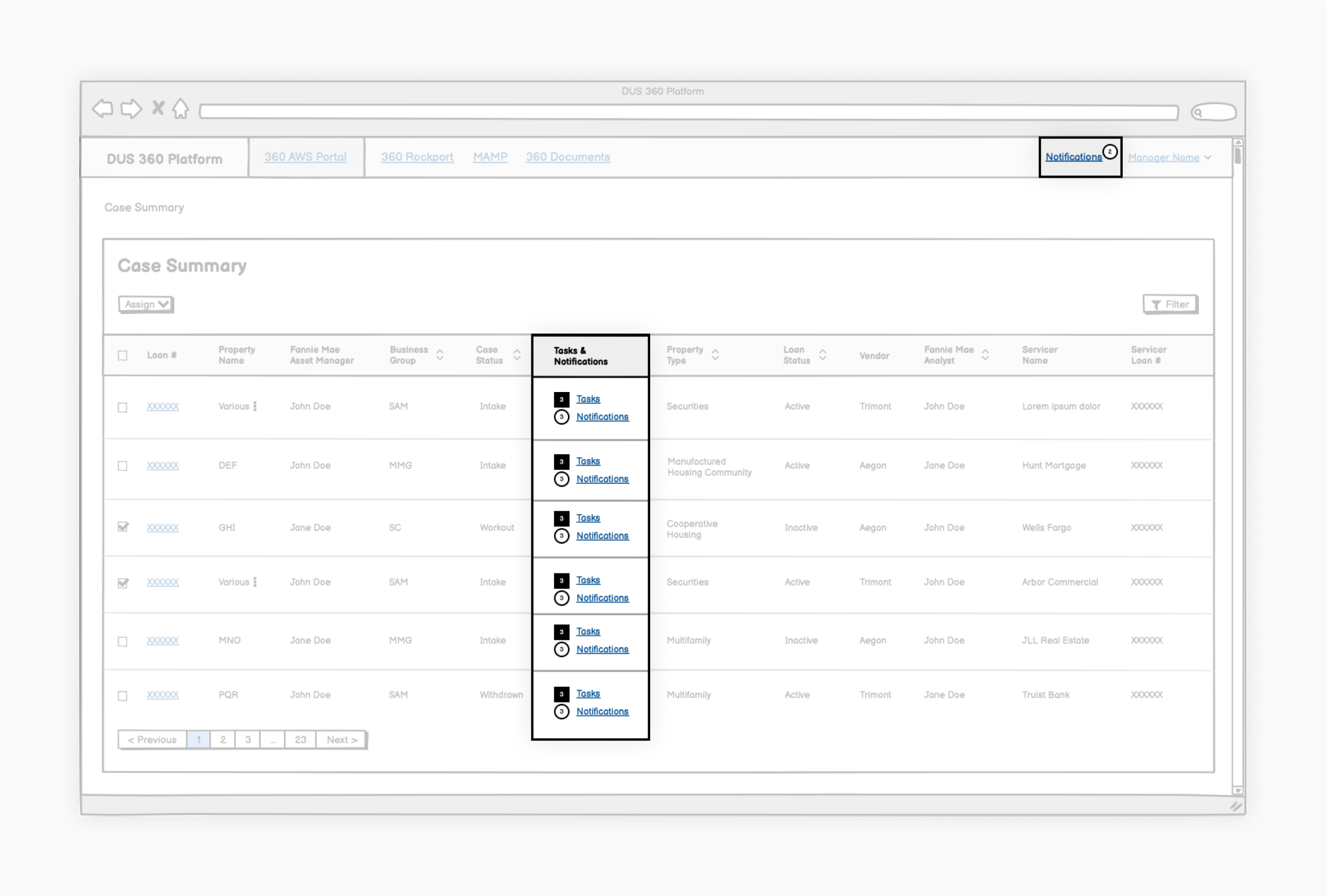
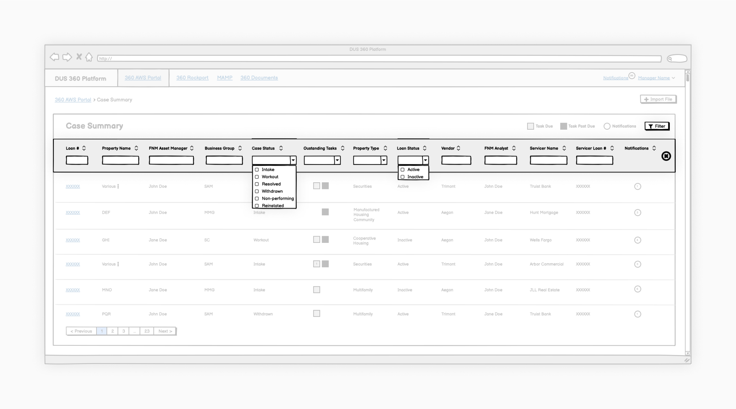
Case Summary View tasks and notifications—We combined tasks and notifications into one column because they were thematically related and to save space.
Tasks and notifications
Keeping track of the status of work
Users needed a way to easily view the number of tasks and notifications for a specific case. Given the information-rich nature of the dashboard, we wanted to ensure our approach highlighted relevant information without overwhelming them.
✅ Recommendations
Combine and display both tasks and notifications within a single dashboard column
Use color and shape to provide visual differentiating cues that users could easily scan. Users could then drill down to underlying detail pages for a more detailed record
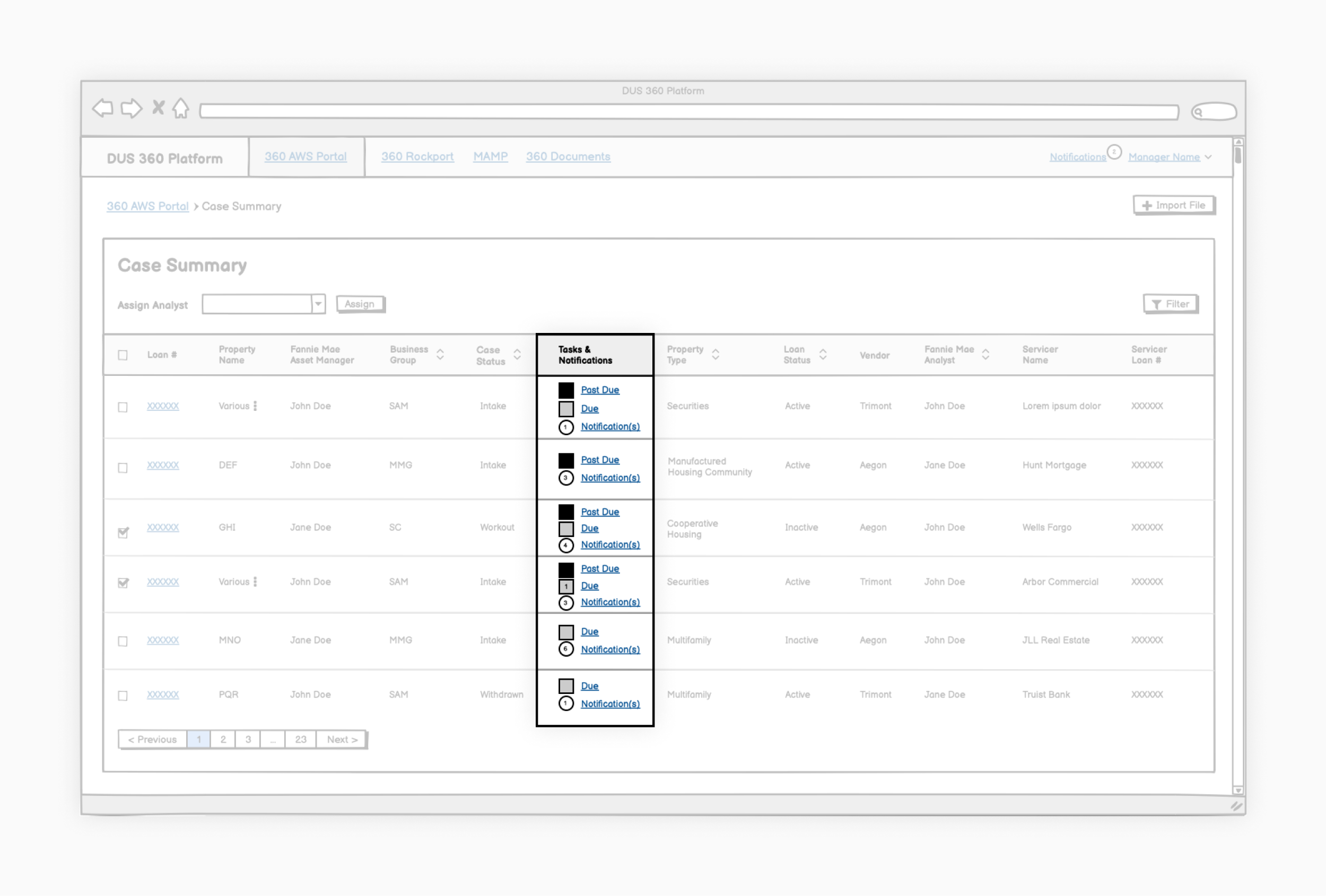
An early solution to organizing tasks and notifications—We needed to understand the difference between past due tasks, due tasks, and notifications and how they were used. While the feature requirements made this distinction, after consulting with users, we discovered it wasn’t meaningful to them.
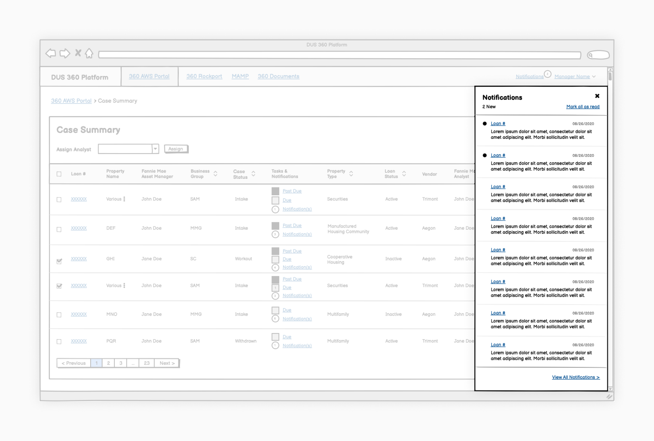
Slide-out global notifications concept—We considered a global notifications slide-out component for users to easily view loan notifications. However, we quickly discovered that this global list wasn’t useful when taken out of the larger context and that users knew cases by specific property names and not loan numbers.
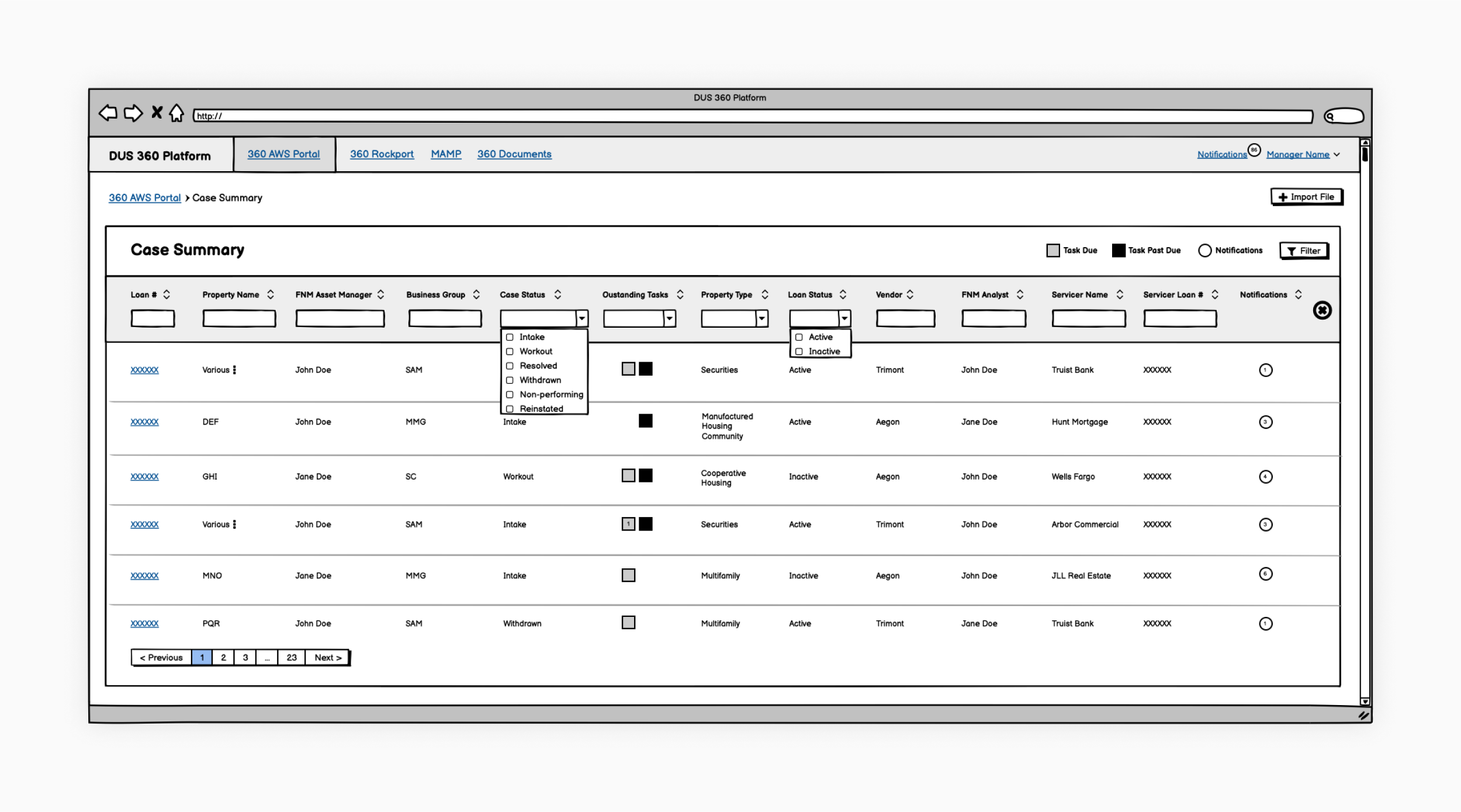
Case Summary View filters—We combined filtering and sorting as part of the column headers. These could be hidden to help simplify the interface when not in use.
Filtering
Locating and searching for cases
We interviewed users to determine how they located specific cases. Filtering and sorting were common solutions. However, one of the first iterations demoed by the development team did not follow standard filtering conventions.
✅ Recommendations
Hide the filters by default to simplify the dashboard interface
Update column filters to appropriately reflect the type of filtering being done
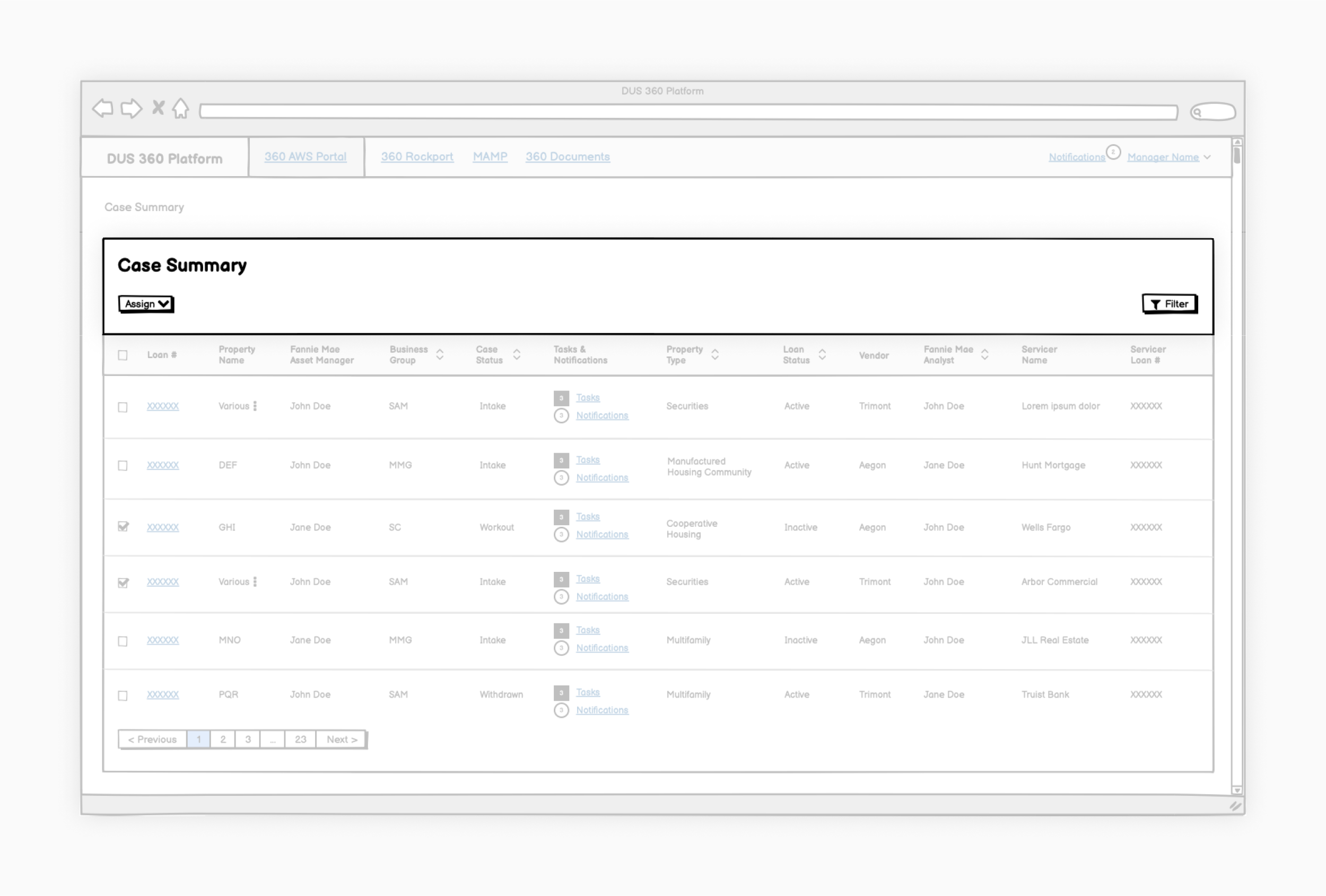
Case Summary View bulk actions—We included bulk action functionality with built-in logic to allow users more control over which assignments were applied to which cases.
Assignments
Carrying out bulk actions
Users also needed a way to easily update case statuses, assign contacts, and indicate asset managers.
✅ Recommendations
Update case assignment flow process
Revise language and modal usage in alignment with best practices
Review logic and error messaging
Include bulk assignments functionality to address user needs
Case Summary View microcopy—There were multiple other instances where simple microcopy changes could help users navigate and use the dashboard.
Information Architecture
Labeling and reorganizing
We discovered several other navigational and organizational improvements across the different areas of the portal.
✅ Recommendations
Labeling microcopy throughout the dashboard to more intuitively align with user expectations
Prioritizing and potentially removing columns within the Case Summary View to reduce complexity
Impact
Implementing our UX recommendations
By the release of the MVP, we had drafted recommendations for more than 10 high-impact platform features over 10, two-week sprint cycles. Despite the short turnaround, the engineering and product teams were receptive to many of our recommendations and incorporated them to the best of their ability given intense timing and resource constraints.
10+
Platform feature recommendations
10
two-week sprint cycles
Learnings
Prioritizing small, incremental improvements
⚙️ Developers and designers work on vastly different timelines
Balancing different design and development timelines was a challenge. We prioritized focusing features that would be implemented several sprints in the future to allow adequate time for research and testing.
💡 Ideas that didn’t work the first time may work the next time
Some solutions and ideas we had explored earlier in the iterative process were reconfigured or revisited later.